One does not simply open a link to [content unavailable]
Thanks @avrong for the video
One does not simply open a link to [content unavailable]
Thanks @avrong for the video
Content: fits on one screen
Twitter: let’s make you click 10 times to see it and after each click you wait three seconds
Modern engagement-driven services are crazy
To make things interesting, put Close buttons in different designs at different corners of the screen
Thanks @mikeozornin for the picture

If you ever forget which months are there, Google won’t help you
Thanks @FaviFake for the picture

If your button doesn’t fit, just rotate it 90 degrees (194°F)
Thanks @obrizan for the picture

Yes, that’s exactly my phone number! Dial it: ten stars, three, five.

Using modern computers is just guessing what is a button and what is not

Just... Why?

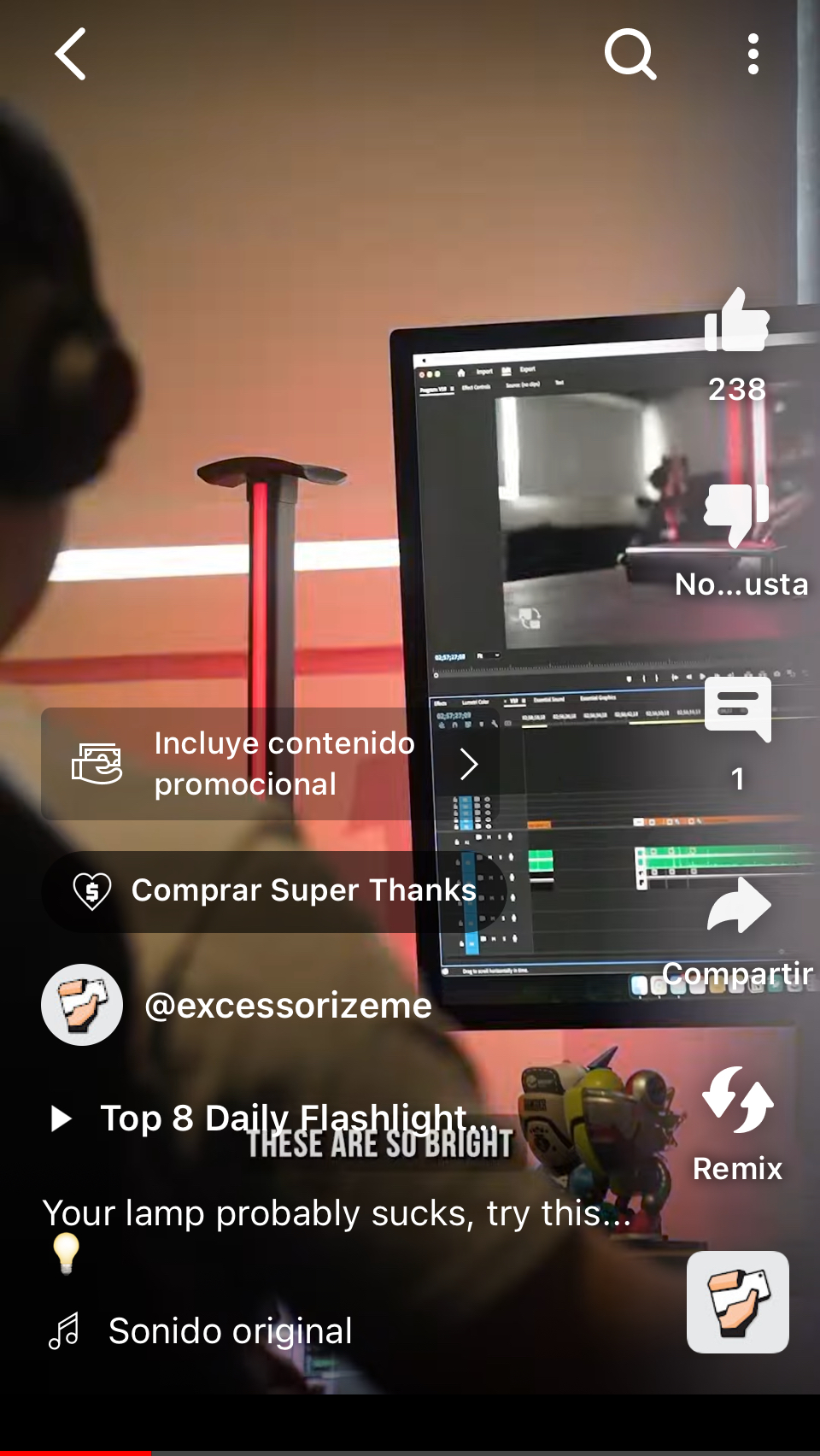
Another case of UI over content. I would love to see the menu but Google decided that all four corners should be occupied by something irrelevant
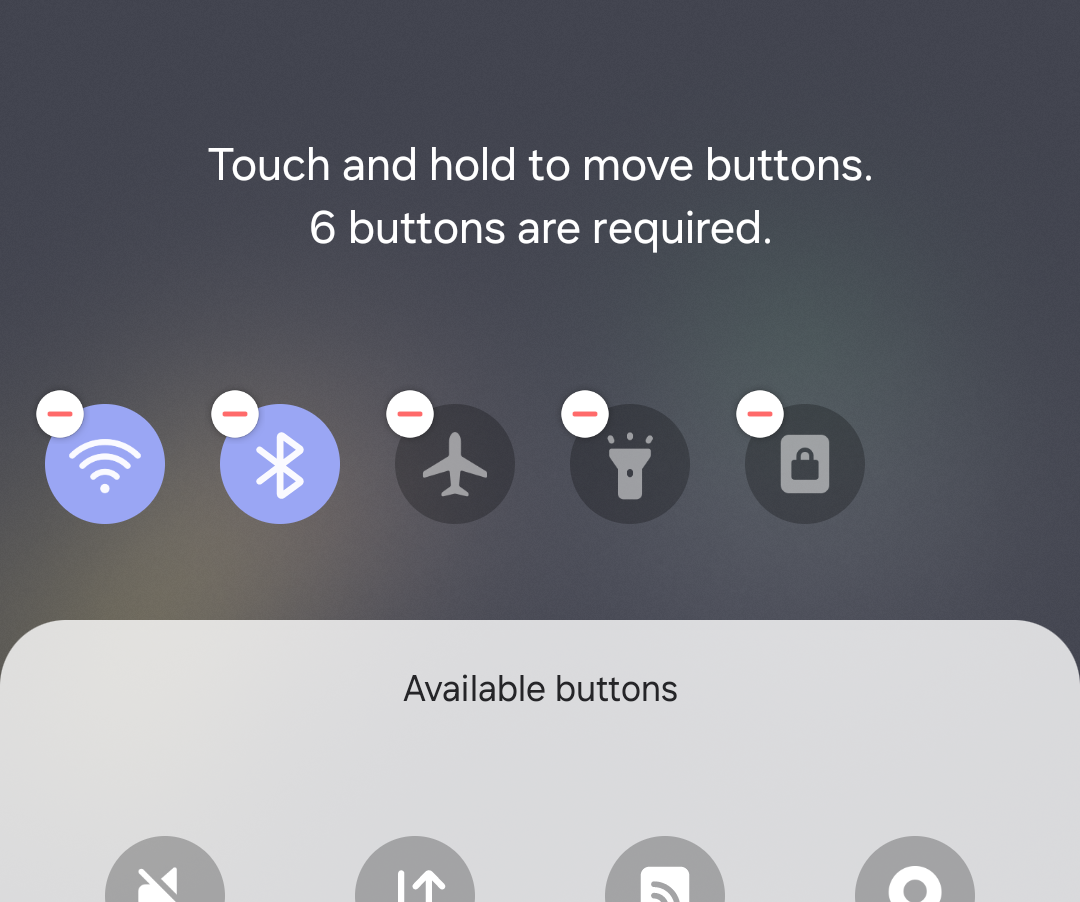
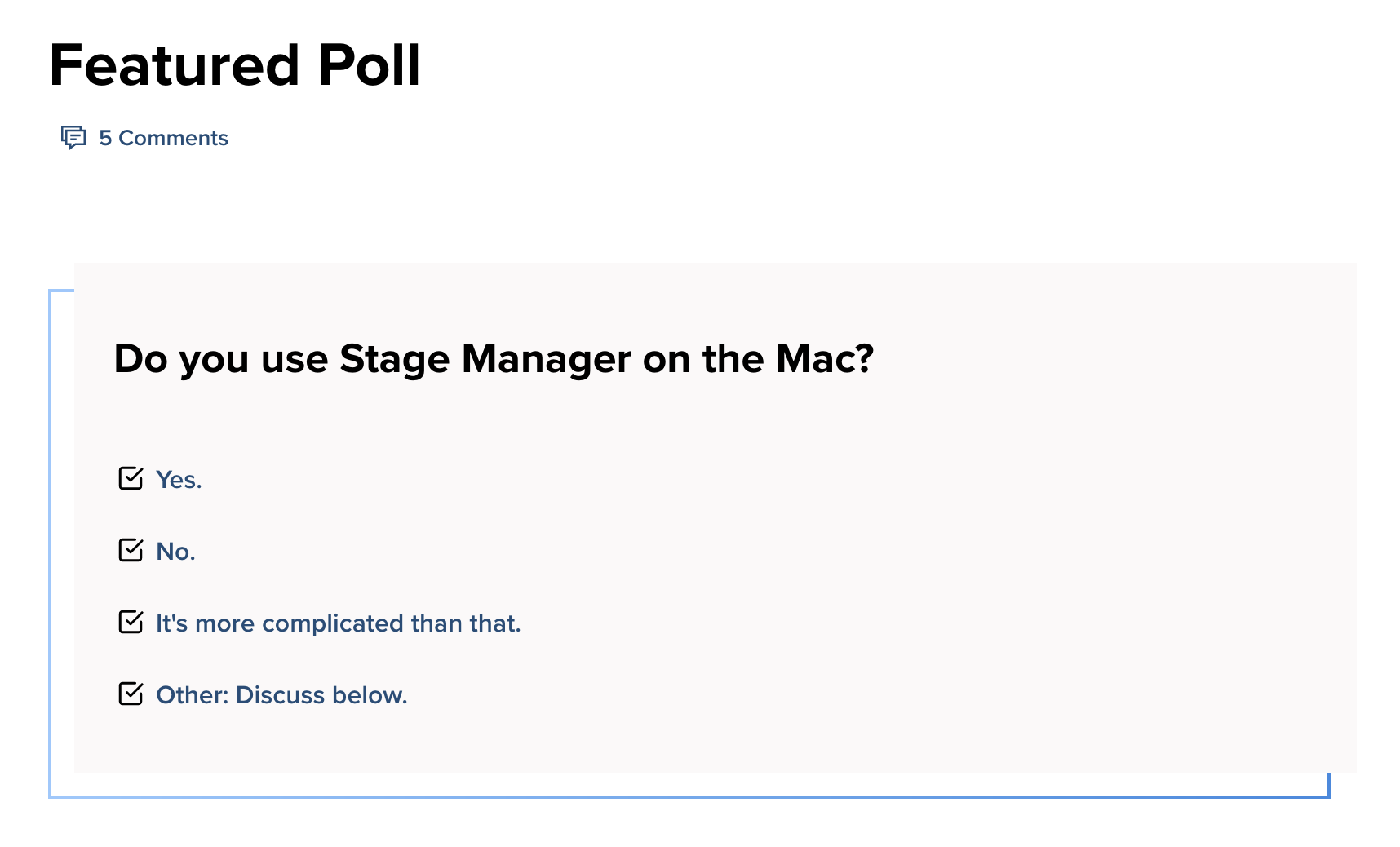
Required by whom? Clearly not user. Who decides these things? If I want five I should have five!
Thanks @antoon334 for the picture
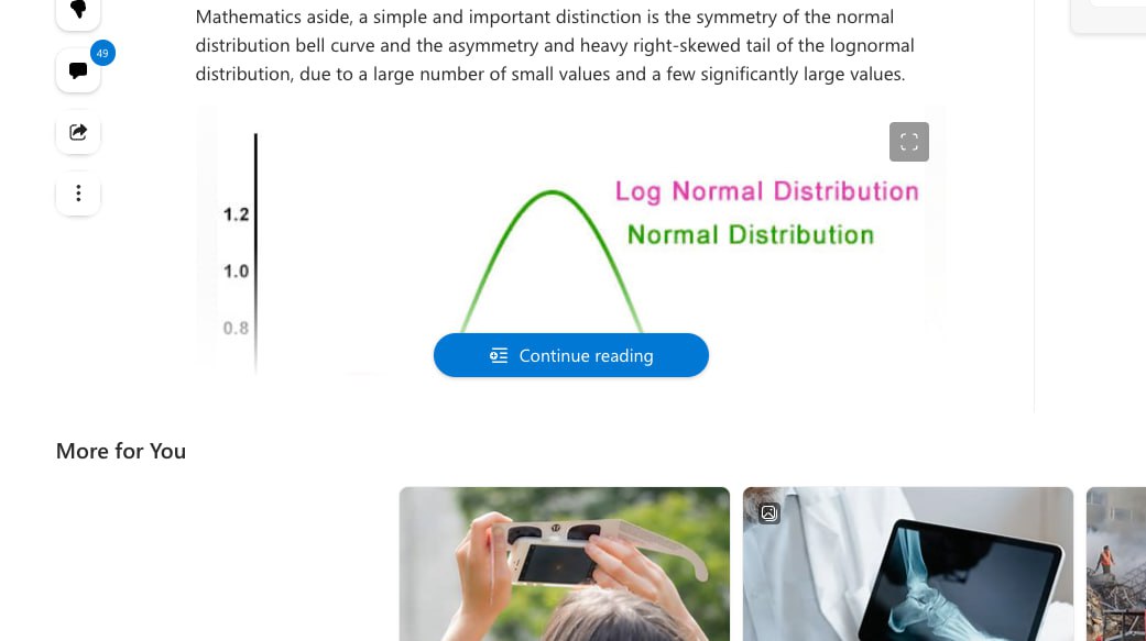
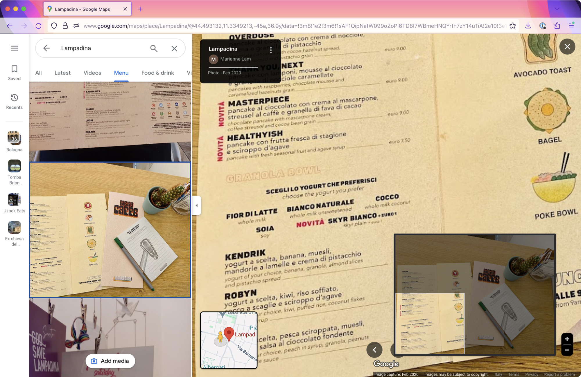
Do you know the best way to continue reading? Show the freaking article!
Thanks @grishka for the picture
Please don’t change the state of control before I click. It’s very confusing
Pro tip: it’s not necessary to make each line individually scrollable