
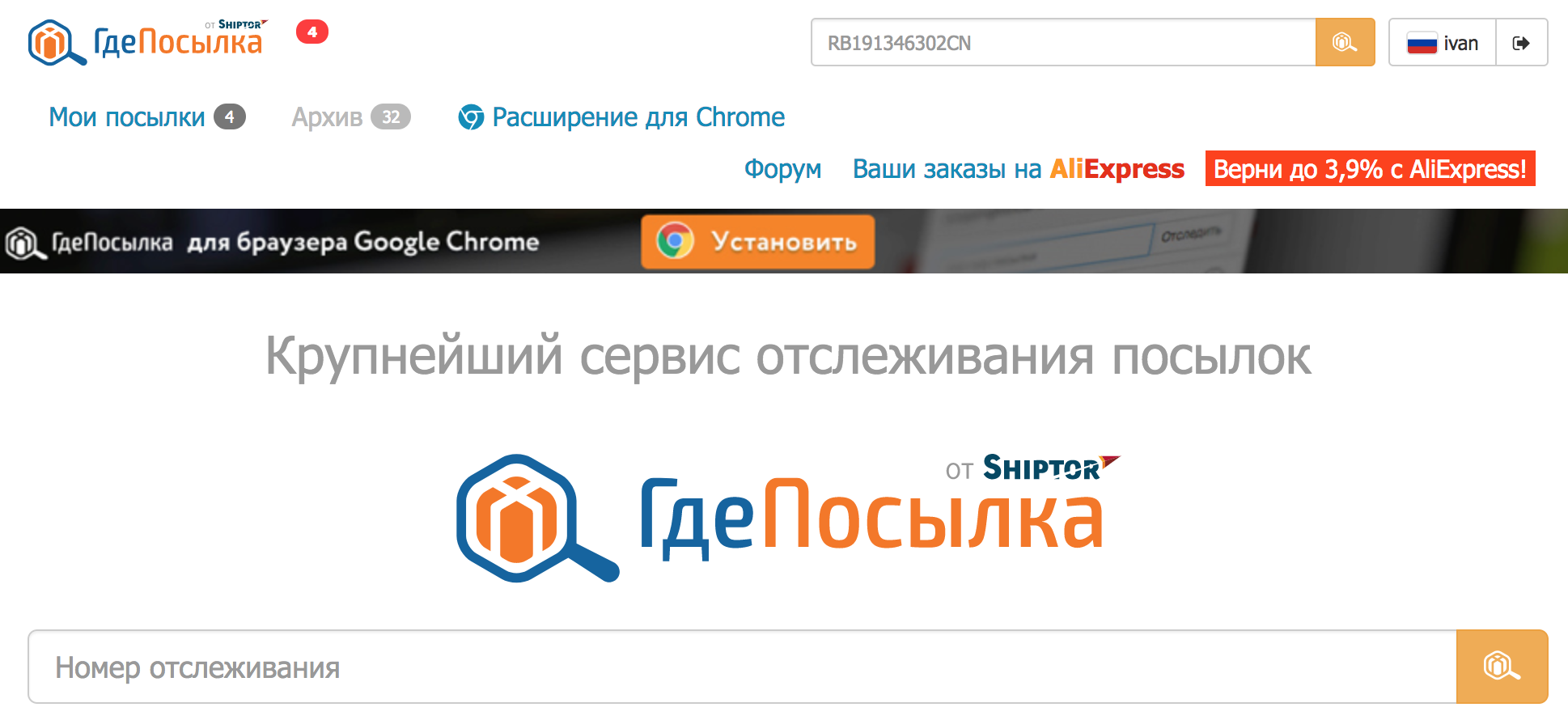
GdePosylka, a famous Russian shipment tracking service, has a strange detail. When I open the main page being logged in, I expect to see the dashboard with a list of my parcels and their state. Instead, it shows a huge logo with a search input that both duplicate the same elements in the header above.
What's the point to spend so much space on those things? Because if I'm already logged in, it means I already know what's the purpose of that service and what it does. Show me what I came for, leave the logo for anonymous users.