
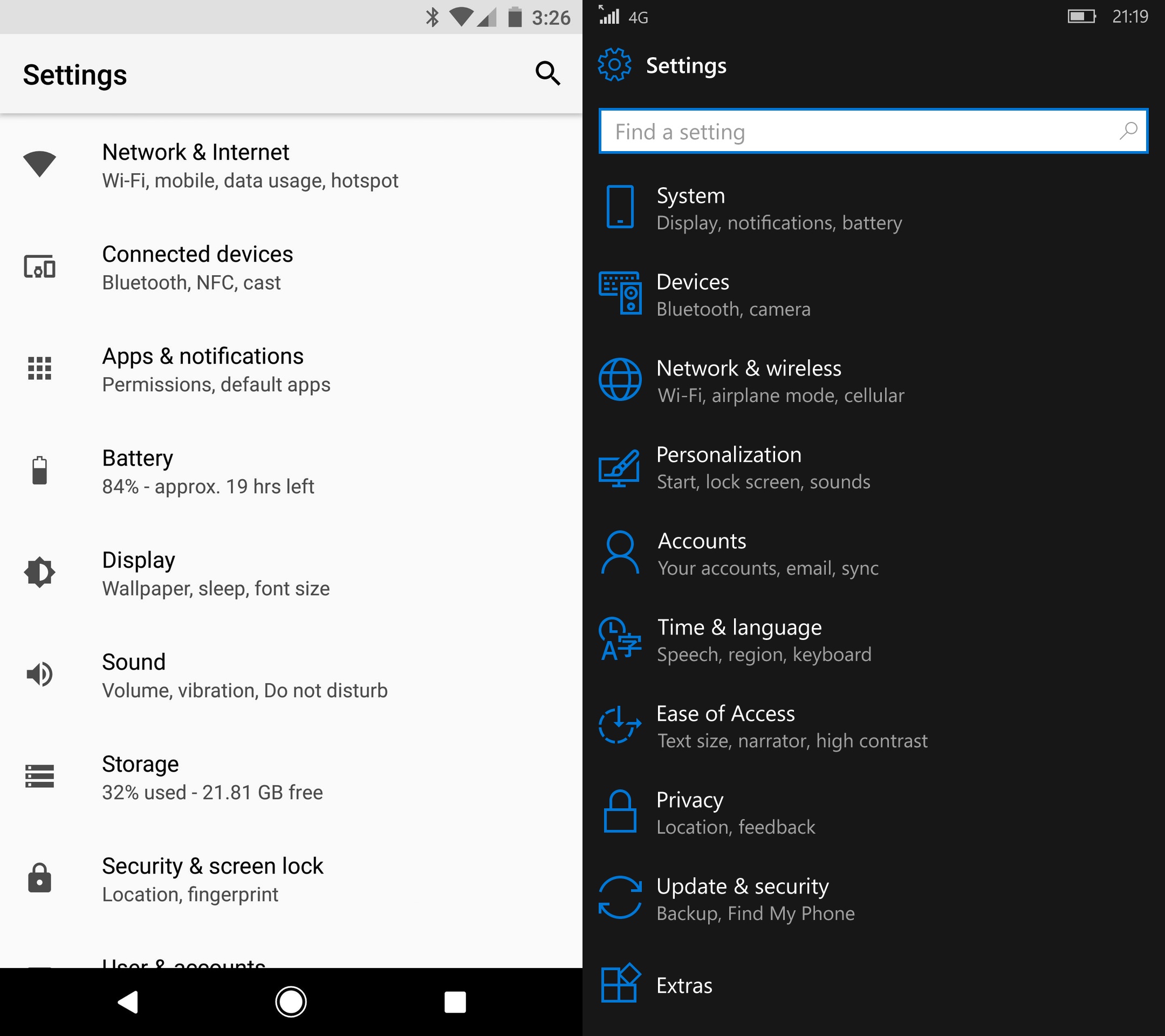
Windows Phone 10 decided to group its settings into categories (right). Android did the same in 8.0 (left). Before/after picture for Android: cdn.arstechnica.net/wp-content/uploads/2017/07/Android-8.0-Settings-DS.png
The goal is clear—they want to keep Settings screen short and tidy. That worked, but at the cost of making it almost impossible to use.
You see, if I need to restart Bluetooth, I’m not thinking “Which category does Bluetooth belongs to?” I’m just scanning the list for the word Bluetooth. At no point in my head I visualise the words “Connected devices” or even just “Devices”. I want to restart Bluetooth. My goal is to find Bluetooth. I don’t care about devices, to be frank.
Even worse, those categories make no sense. Just look at it: Location in Security? Vibration in Sound? Sleep in Display? Font size in Display? Keyboard in Time and Language? Find my phone in Update & Security? Seriously?
The grouping only works one way. Given the items, it’s totally possible to group them and make up categories. But given specific item, you have no way to figure out what category those ill minds invented for it.