
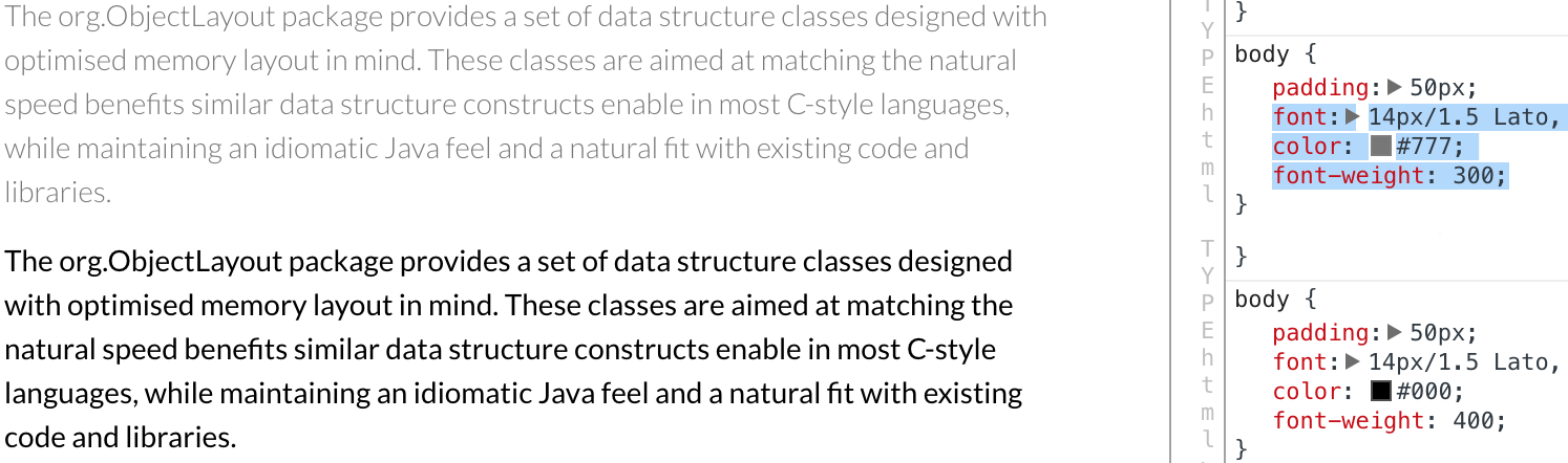
someone somewhere told designers that grey text looks “lighter” than the black one, and that the fonts also have light variants (Regular font weight is 400, Light is 300). Sure the page looks fresh and clean with grey font and light font, with the only downside that nobody can read a word. Only use font-weight: 300 on headers huge enough they could actually be read, never for copy text. And don’t be afraid of black text: the more text/background contrast your letters have, the easier it is to read. And no, nobody sees black text as something heavyweight or pessimistic. It’s alright, it looks bold and it’s a pleasure to read