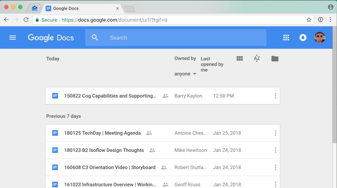
Isn’t it ironic that in the era of UIs that are perfectly usable on 320px screens Google Docs is unable to render a short Material Design menu in a 960px wide window? Also puzzled why so much space is reserved for vertical dots (may I remind you that vertical dots icon was invented as a means to save space on small screens)
