
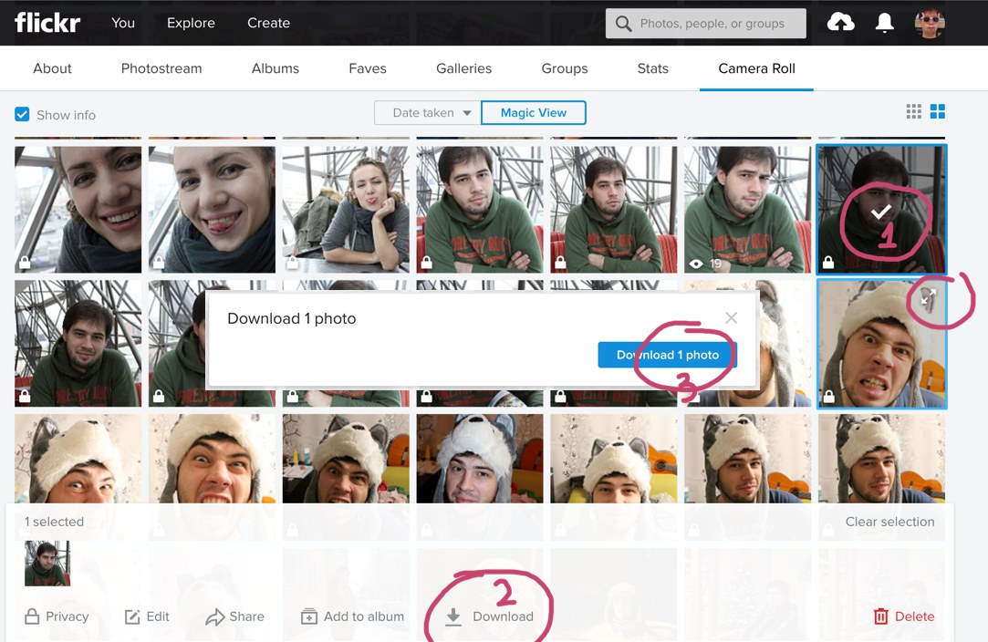
Ah, Flickr. A photo hosting website that is good for anything but browsing photos. Here you can see their “Camera Roll” UI that is part of Flickr UI renovation.
Yet, to download just a single image, you have to select it (1), then travel all the way down to “Download” button (2), and finally back to the center of the screen to the “Download 1 photo” popup (3). Seriously, it’s just one freaking image, how hard could it be?
One more UI sin you can spot on this picture is the fact that clicking on a thumbnail does not open the big version. This should be one of the fundamental UI principles, in my opinion: if you see something that interests you, and you click on it, you _have_ to get a bigger version.
On a Flickr, though, to see a picture you have to hunt down small Expand (or whatever that is) icon in the top right corner of each thumbnail. Even worse: those icons are invisible, so you have no idea they exist or can’t travel directly to them, you have to hover thumbnail first.
One word: a messr.