
This is our microphone, a part of a "professional sound system" that we use for questions from the audience. When editing our records, I found that most of the people were speaking when the microphone was turned off.
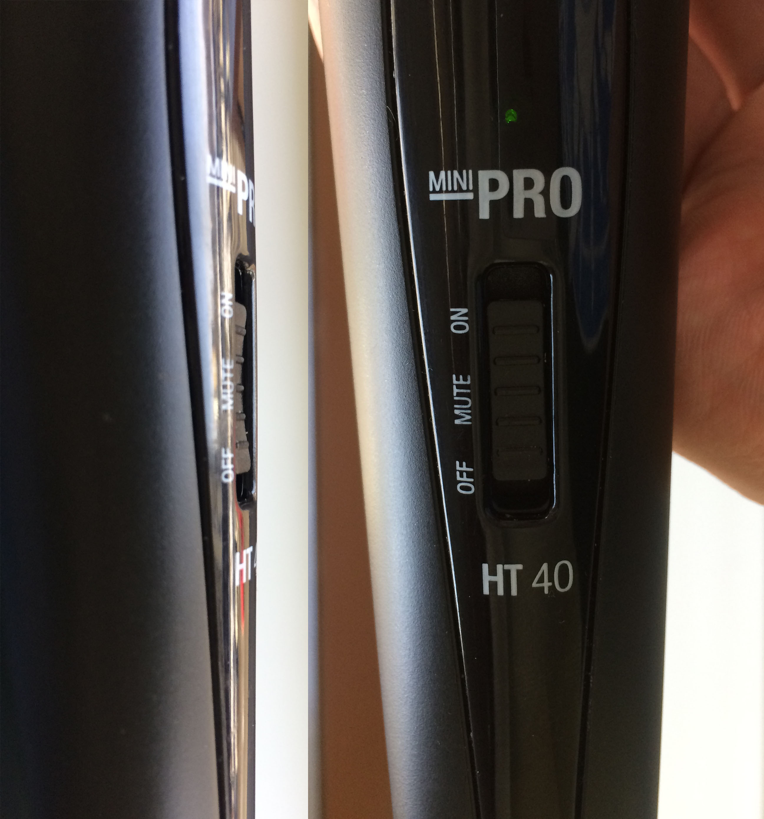
Look, isn't that switch button made great? It has three positions; two would be to few for a "professional" one. Mute is in the center, the most common place for that switch. Being muted still makes green led to shine, so a person who stands in the darkness just looks at it and thinks that everything works. And you really need long fingernails to move that damned thing to the most top position where if finally starts working.
Now imagine you need to deliver all of this to every person in the audience.
Was it so difficult to make just a convex turn on/off button? Would it be to "unprofessional" otherwise? Thanks to "great ergonomics and user experience", we've lost our records -- the very thing we bought the device for.