
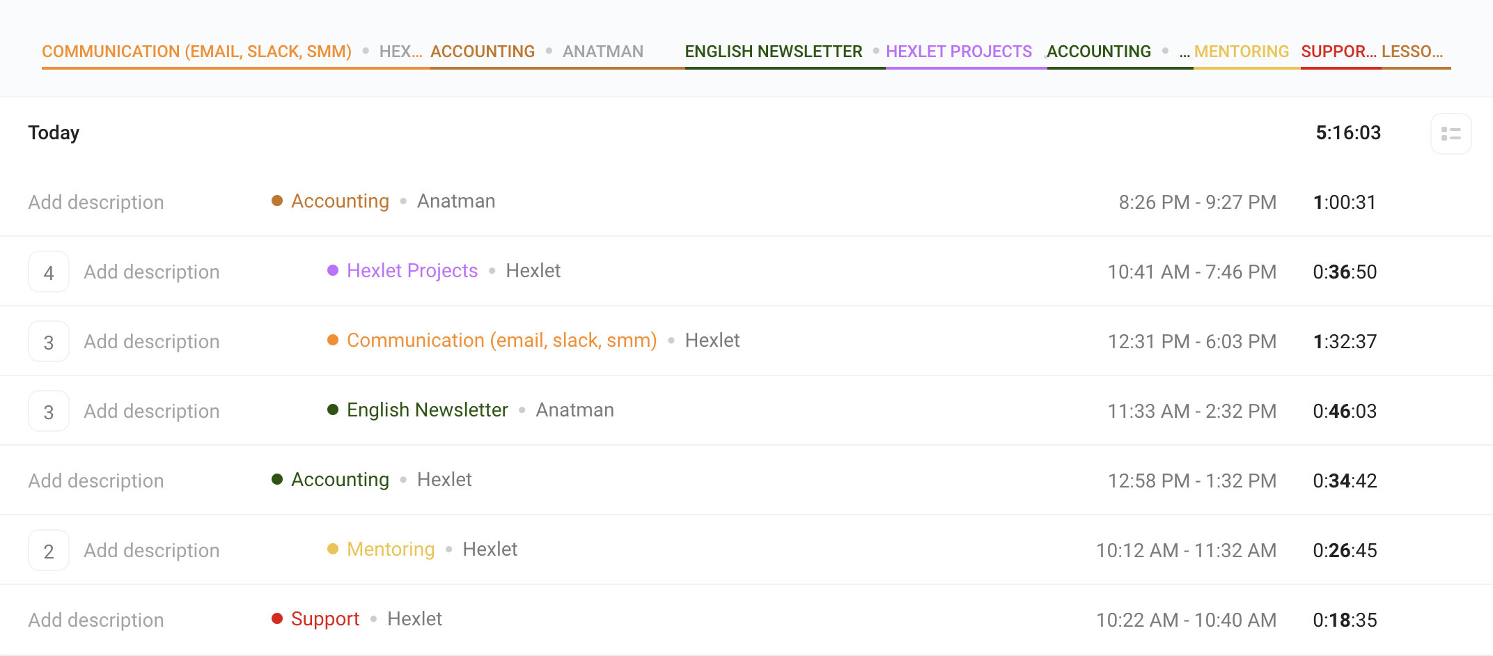
This is the dashboard of Toggl, a popular time-tracking app. It's a great example of how incorrect use of visual conventions make things extremely confusing.
The whole thing looks like a table — which makes sense, it's a time tracking app after all. The top bar looks like table columns with titles. It's not! And the whole thing is not a table.
The main content is the time slots that had been tracked. If two or more slots are tracked within the same project, the number appears on the left and the whole line is indented to the right. Now it looks like a hierarchy, right?
It isn't a hierarchy, it's just bad design.