
It's a classic non-problem: you want to use one element to indicate the status AND to toggle it. This works fine for phones: you see a big red HANG UP button and you know that the call is ongoing at the moment.
But it rarely works elsewhere.
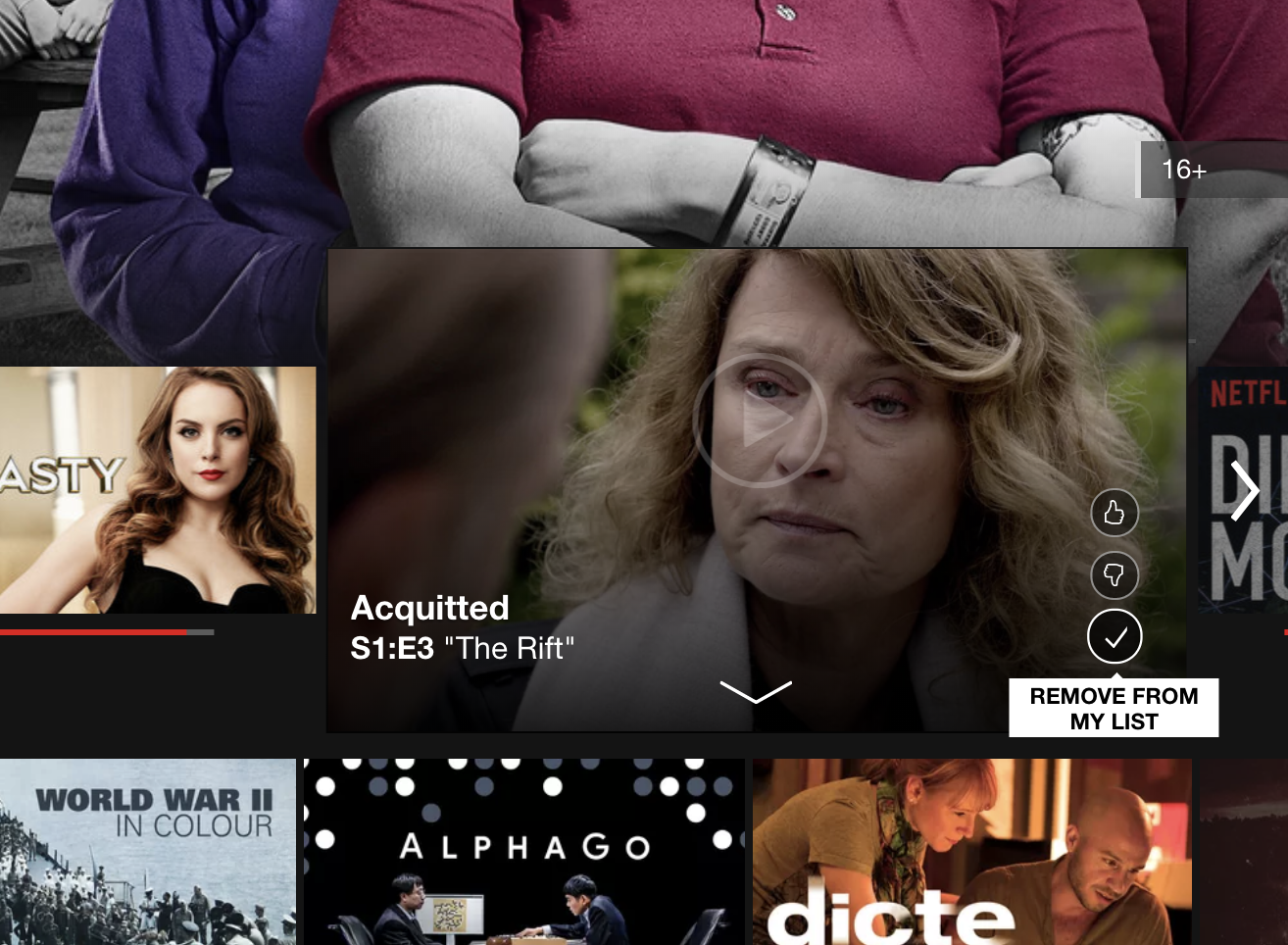
Here Netflix uses the check ✓ to show that the item is in "My List", and clicking it removes the item. This is extremely weird: ✓ is to remove!
Why is it a non-problem? Because you can just divide this into two explicit elements: one for status, one for action. Yes, it won't be as minimalistic and "cool", but it will make perfect sense and avoid visual paradoxes.