
When you need a toggle, don’t use a button. That’s because button label can be read as an indicator of current state or as an action to switch to alternative. [ OPEN ] — does it mean it’s open now or it will become open when I click?
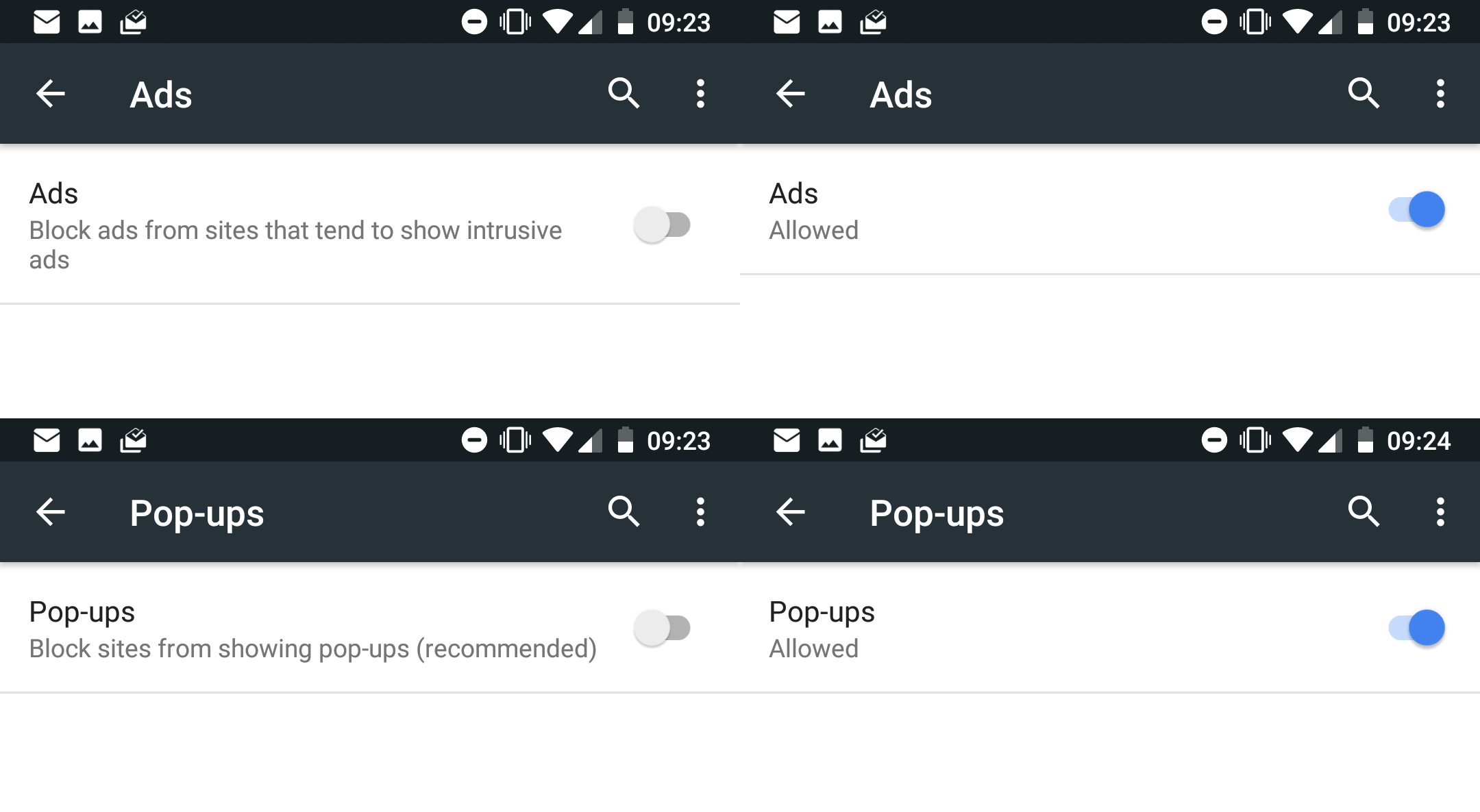
To get around that ambiguity, use checkbox. When it’s on, what label says is true. When it’s off, what label says is false. [ ] OPEN means not open. [v] OPEN means it is. Simple, unambiguous, well-understood. And don’t put negatives on the label because it’ll become double negative when read and will be confusing again. It’s like UI 101.
Except when you’re Google (grumpy.website/post/0PMmG9X3u). It seems like they wanted to add clarity by describing the current state but they broke the grammar of the UI in the process. So label says “Block adds” but checkbox is off, meaning... Don’t block adds? In reality, they wanted it to mean “Do block adds”, but used the wrong UI element for that.
Saying “Ads” / “Popups” on a checkbox is kind of wrong, too. You’re not controlling the ads, you’re controlling ads _filter_ in the browser, so it should say “[ ] Allow Ads”, not just “[ ] Ads”. I guess that’s the reason you felt your label needs additional explanation in the first place.
Also, why do you need a whole screen for a single toggle option? You’re literally showing it inline on that very screen.