
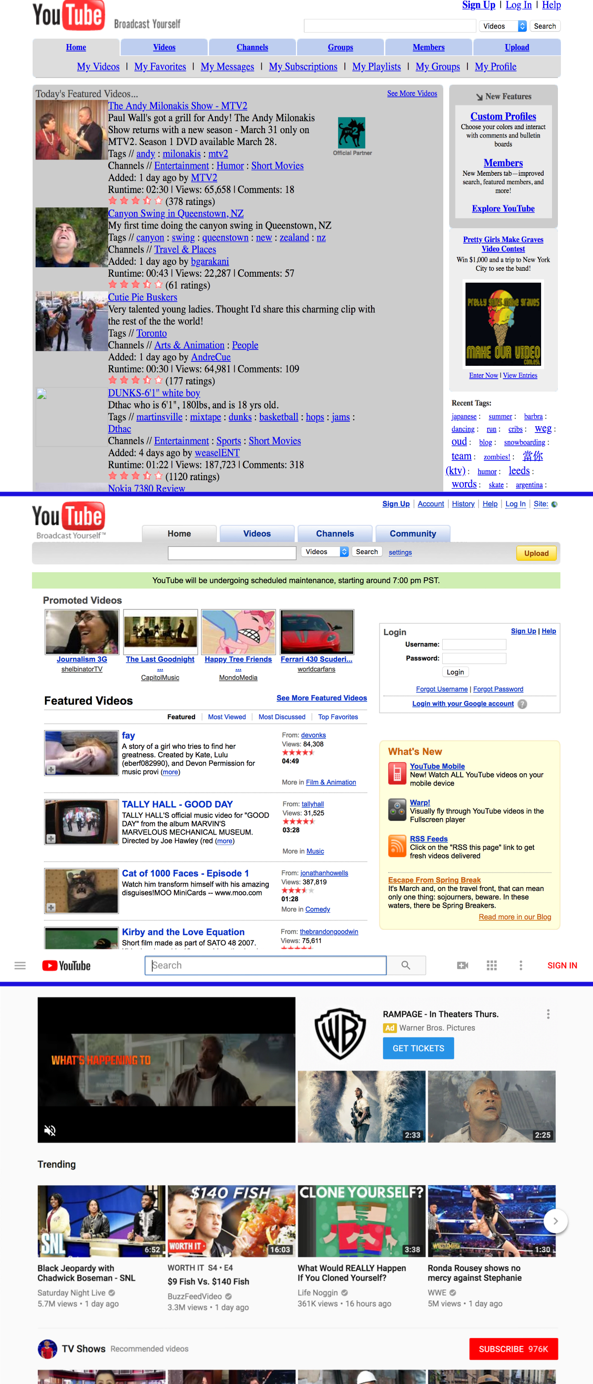
Museum of Websites (kapwing.com/museum-of-websites) is a gallery of popular websites' evolution over time. You can clearly notice the pattern many projects go over. It usually looks like this:
1. Ugly and functional.
2. Nice and functional.
3. Ugly and dysfunctional, but "trendy" and "modern".
Take YouTube for example:
1. Initial version: ugly and functional. Made by engineers. Pretty ugly, but 100% functional. Everything is clear, links are links, buttons are buttons. Pure HTML, native behaviour, no JS enabled bullshit. Nothing breaks UX, even if that UX is not aesthetically pleasing.
2. Version two: nice and functional. Aesthetic iteration over the initial version. This is the sweet spot! All the benefits of the "engineers" versions with some nice whitespace and proper placement of elements.
3. Current version: ugly and dysfunctional, but "trendy" and "modern". The information density is reduced to the point of uselessness. Links don't look like links, buttons are sometimes links, links are sometimes buttons. Native behaviour is broken in many places, JS does half the work of the browser and it's very fragile. Most of the things are hidden behind multiple clicks.
(Note that not all screenshots are 100% accurate; they are probably taken from the archive.org and sometimes they don't cache CSS properly. The first YouTube screenshot is probably missing some styles for whitespace)