
Last in the list of GMail redesign sins is button shape.
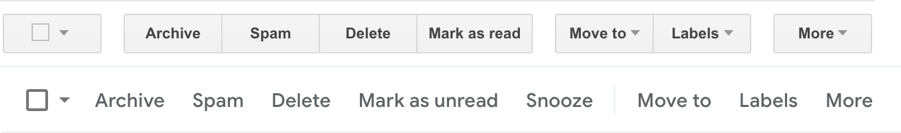
The old buttons (top row) were bulkier, but they were clear: buttons looked like buttons, they had clearly defined boundaries. After a quick glance you knew immediately what’s going on and what to do. Don’t make me think™.
After the redesign, buttons are now text labels, and whole row is just one big sentence with no indication where one starts or ends. Sure, there’re _subtle_ signals, but they are so subtle you actually have to keep in mind that those are actually buttons that look like text. The interface does not speak to you, you just remembed what it used to be and had to remind yourself “these labels are supposed to be buttons” constantly.
Previous parts:
Terrible layout grumpy.website/post/0PtjXmFEK
Nauseating animations grumpy.website/post/0PuSXQmsl
Annoying on-hover buttons grumpy.website/post/0PugAwZf_