
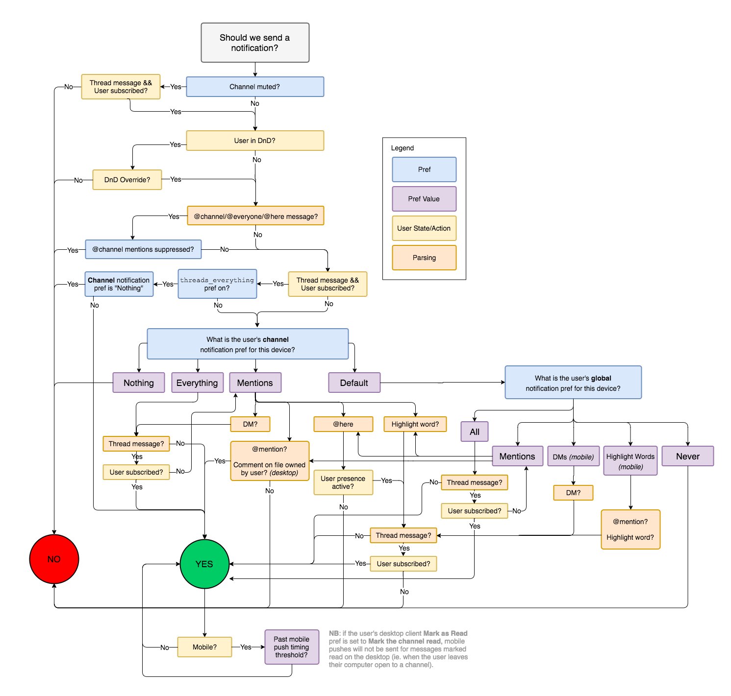
You might’ve seen this picture. This is how Slack decides whether to send you a notification or not. Usually it’s posted with a comment like “if you’re a programmer thinking you could build Slack clone over the weekend, there’s more to it than it seems”.
Yet when I see it I see what Slack is famous for: complexity, no clear principles or vision, hard to understand UI. Workspace system, terrible threads, unclear right panel, inconvenient shortcuts, miriad ways to catch up with no clear/preferred one. And yes, notifications that bother you even if you didn’t expect it (@here, for example).
I mean, yes, to build great product requieres great amount of work that’s easy to underestmate. Ten times true for polishing the interactions. But if all you can provide is great amount of work you’ll end up with an overgrown Frankenstein monster creepning with features. It’ll consist of many little decisions and interaction which would almost make sense on their own, but altogether it’ll be a mess.
What you also need is an ability to simplify, clarify, communicate, reorganize in a better ways, throw away. Integrate. Connect. Reuse and rely. Not just add. Even this diagram could’ve probably been simpler. So could Slack.