
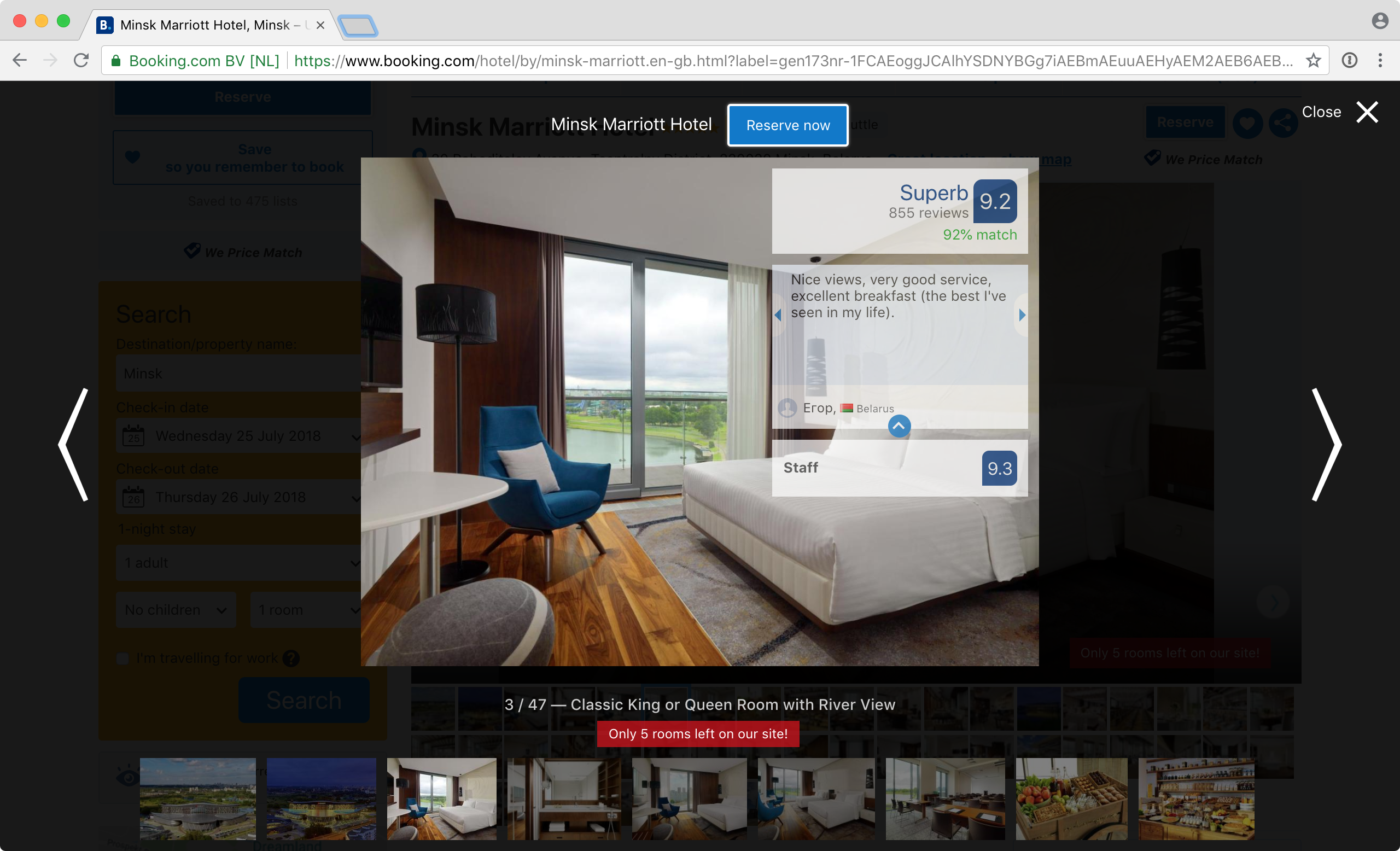
The badness of booking.com UI is usually explained by their greed. This one, though, I can’t find any explanation for. Hotel photos are supposed to sell the hotel—yet Booking covers good half (!) of each (!!) photo with almost opaque irrelevant rectangles. No, you can’t close or hide them. Yes, they are animated. Of course they are.
Given that it is most certainly not about fitting as much info as possible on a page (look at how much empty space is there around each photo!), the only explanation I can come up with is: average hotel photos are so bad that obscuring them with “Superb” reviews actually increases conversion. Good job Booking!