
Don’t use font-weight: 300 for body copy. It’s too thin to be read comfortably. Designers like it because it pages look “lighter”, but it hurts those who would like to know what’s actually written there.
font-weight: 400 is default for a reason—it was carefully chosen to be most comfortable to read. Font designer spent, let’s say, 6 month fine-tuning every letter and every letter combination in her font. Don’t make a decision only because you’ve looked at it 30 seconds and feel it looks “cleaner”.
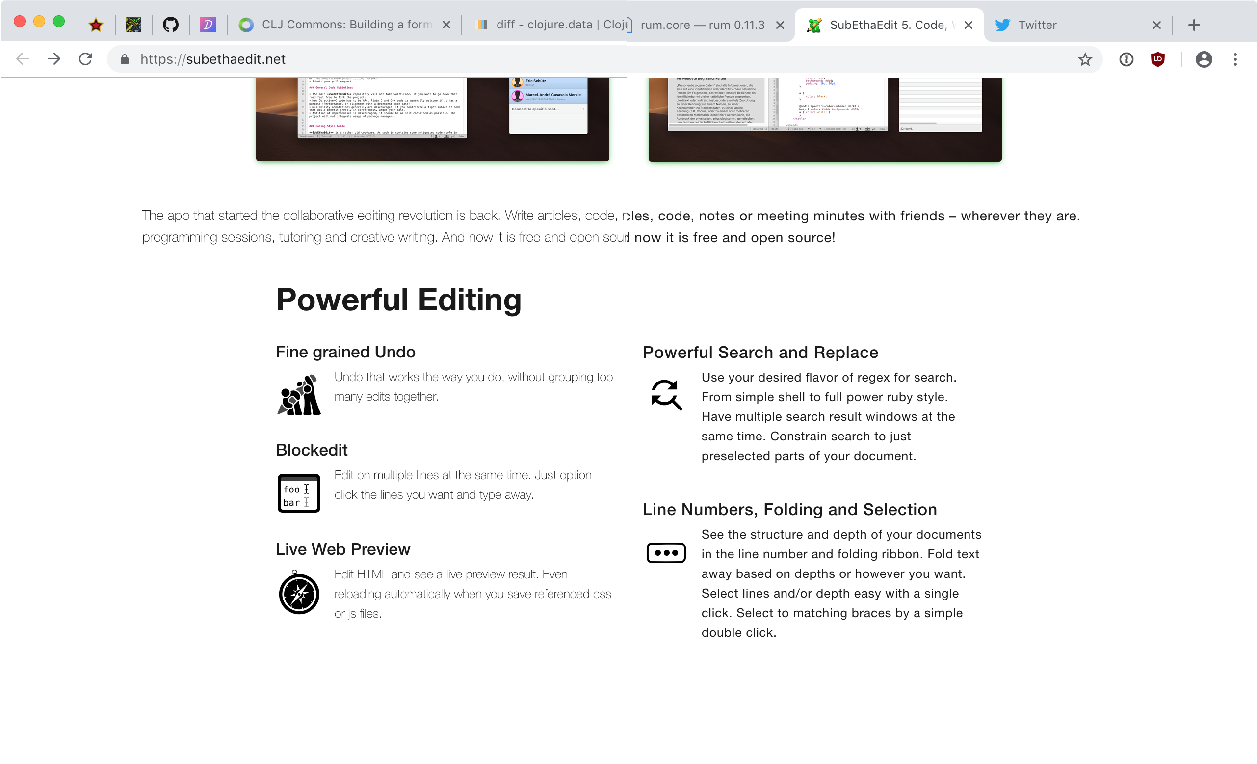
(click on a picture to see it full-size)