
Let's talk about Apple's famous attention to details in UI/UX design.
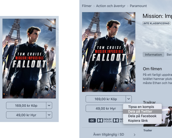
This is an iTunes page with what is clearly two dropdowns: "169 kr Buy" and "49 kr Rent". Over 30 years of GUIs have taught us to recognize this as a dropdown.
Think different!
The texts are buttons. They will respectively buy or rent a movie.
The drop-down arrow opens a menu which has zero connection to the price, or the buy/rent actions. It contains the following: Recommend to a friend, Share on Twitter, Share on Facebook, Copy Link.
It takes courage to do the unexpected or something...