
We don't often talk about the design of things in real life. And we should. Especially when it comes to cars.
Most modern in-car systems are clearly designed by people who have never been inside a car. For the longest time ever Volvo cars have been an exception, but even they succumbed to the Curse of the Touch Screen.
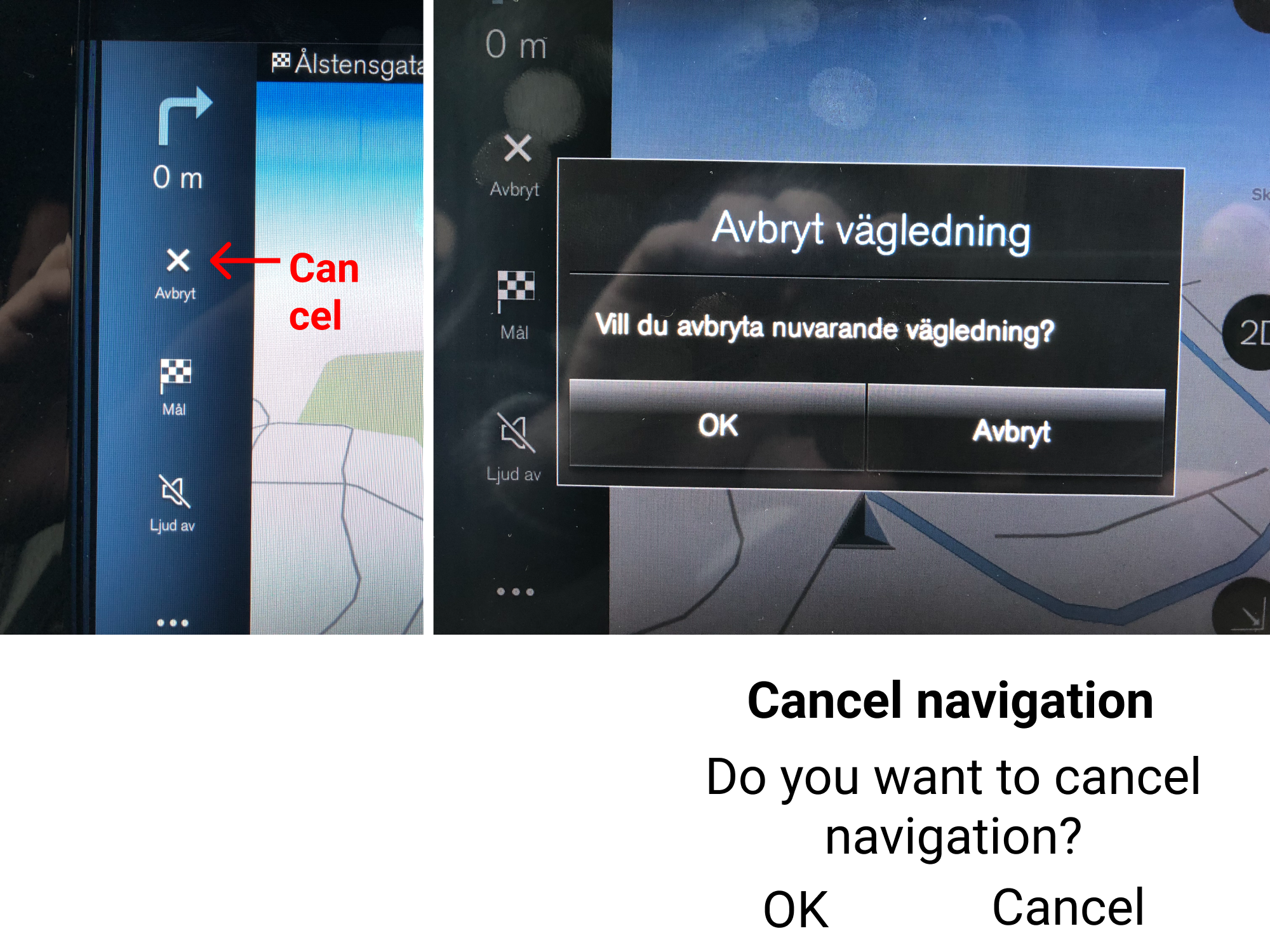
Quite often as you're near your destination you no longer need navigation assistance and you turn it off. This is what happens in a modern Volvo car. Note that none of the click/touch targets are large enough to safely operate with a finger in a moving car. Neither are texts.
- You click "Cancel"
- A confirmation dialog pops up which displays the following: "Cancel navigation. Do you want to cancel navigation? OK / Cancel".
Count how many times the word "cancel" appears in all these interactions. Even your own *intent* is to *cancel navigation*. Naturally, since you can't take the eyes of the road for too long, you click cancel. The dialog is dismissed, and the navigation is *not* canceled.
You have to read the text and/or realise that you have to click OK instead.
A simple solution? Two big buttons labeled: "Cancel navigation" / "No, continue navigation".