
One can't but admire Google's Material Design. It's clean, reasonable, internally consistent and non-contradictory. To see how true this is, go no further than the project's main page, material.io.
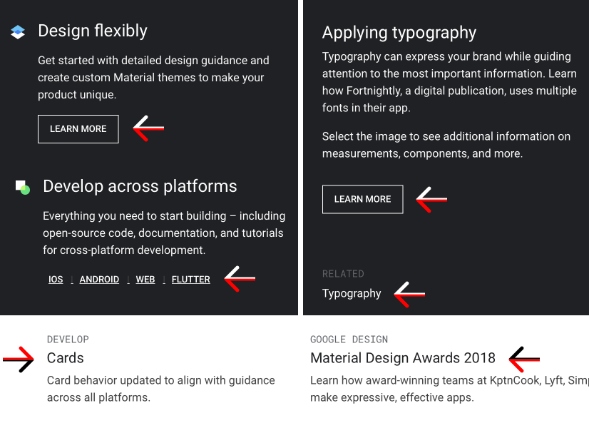
In the screenshot above, everything that arrows point to is links. Links that look like buttons. Links that look like links. Links that look like plain text (btw, good luck trying to figure out whether some plain text is a link).
No wonder their own teams struggle with the design guidelines and come up with the beauty that is Google Maps: grumpy.website/post/0QqUsEQvJ