
How far could minimalizm go?
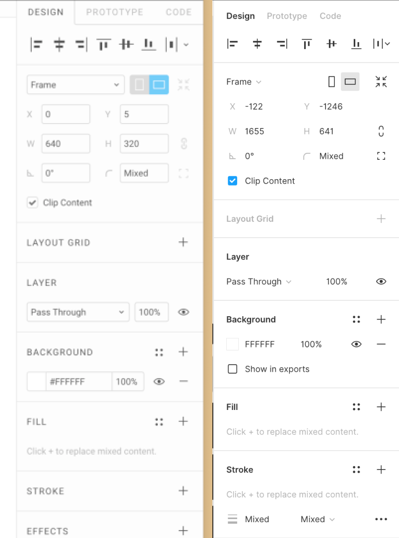
Here you see the latest Figma redesign (before → after). Yes, they removed the most borders around controls because, I don’t know, it’s cleaner?
Cleaner it is, but is it better? I actually admired Figma for how elegant _and_ functional their controls were. Just the perfect amount of detail to communicate what the control is, but nothing too excessive, no hard shadows or gradients. It is, after all, a tool for professional use, something you’ll spend five days a week looking at.
By removing the borders they made it even cleaner, lost a lot in clarity. Controls and labels now look the same.
They became less usable too. Controls are now smaller and harder to click because you only see the text, not the whole control area. And you can only hover/click what you see.
Add to it that dropdowns magically grow in width on hover, that you don’t see a structure in Layers until you hover it, and you get a disaster of a redesign.
Figma, undo!