
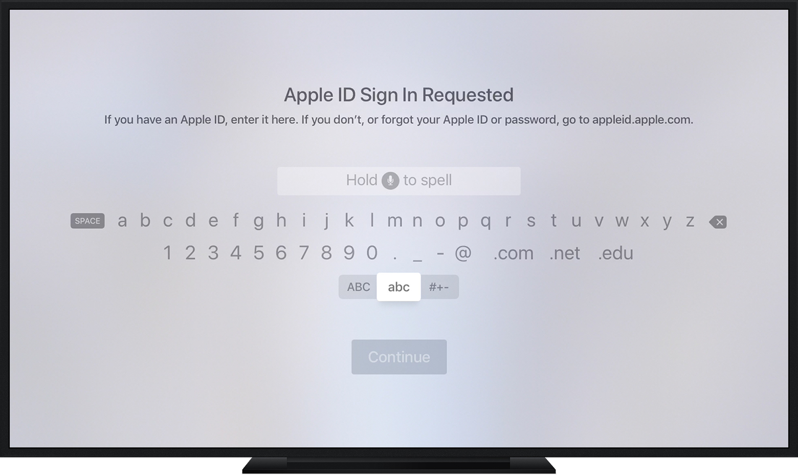
this is almost someone intentionally wanted to harm the user. What happened to the dense rectangle of letters that was so easy to navigate? Why separate tab switch for capitals/symbols? It’s not like there’s not enough space to put them on the same screen