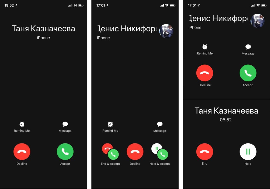
IPhone “Accept call” screen (left) is nice and simple. The tricky one is the one in the middle. It is shown if you are already in a call and a second one comes in.
Imagine: you are in a rush, you already have another thing going, totally distracted, something unexpected happens. You have to figure out what’s going on, make a decision, and make it fast. This is already a high-stress situation. The problem with middle screen is that it is hard to figure out what’s going on.
First, the whole screen is brand new, never seen before. It’s a bad timing for learning a completely new UI.
Then, unlike most situations, here you have TWO object you operate on: old call and new call. It’s unclear on which one each of the button will operate. Decline — what? Old? New? Message whom?
Then, icons. You see familiar icons, BUT they have different meaning here, AND each one appear multiple times on the same screen — why? Why are there two declines and two accepts? Some of them are grouped — what does it even mean? Is it still a single button? Or two? How do I press it?
Yeah, it’s probably a rare screen that didn’t see much love because of its own rarity. But if the screen IS rare, you MUST make it crystal-clear. Because people will never have enough time and comfort to learn what it says and how it works.
The solution is pretty simple. If you have two objects, show them both and give each one its own controls (right). You see “Accept call” screen every day. You see “On the call” screen every day. So you already know how they both work. Nothing new here. Plus it is obvious which controls operate on what. Win-win-win. You are welcome, Apple, that would be $10,000 dollars.
