
I never had a problem with flat design. Github is the first time I don’t recognize buttons as buttons because I am SO used to their canonical design and layout. Now when I move my eye looking for “Merge” or “Clone” and don’t see a shadow and a gradient, only a black text label without any background or border (there actually are some but almost unnoticeable), I just don’t detect them as buttons. They also look exactly like labels, to make things worse.
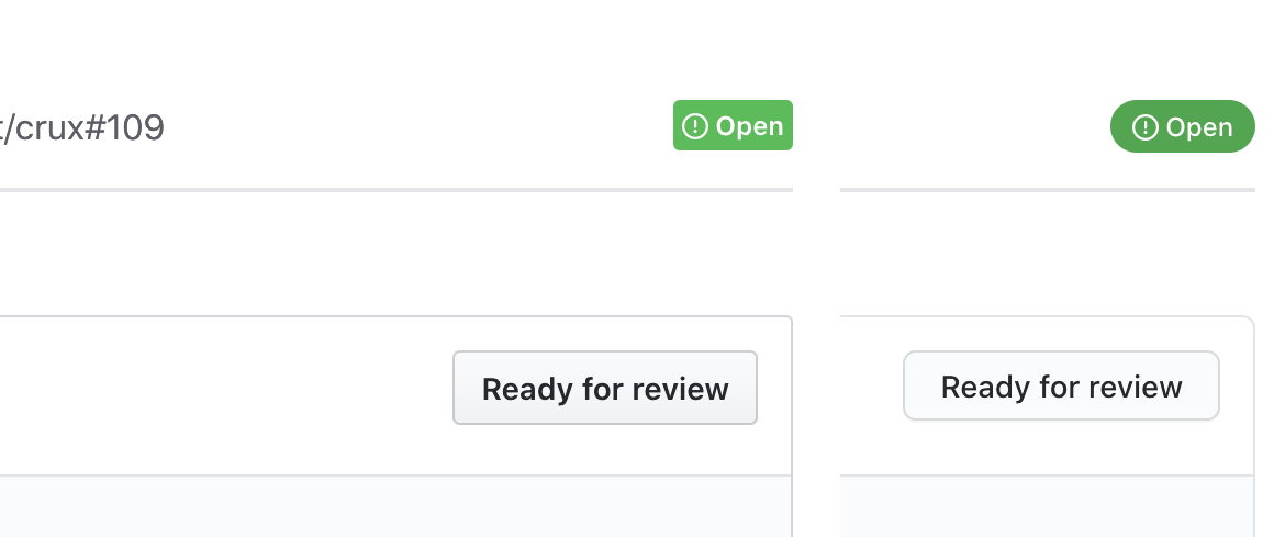
Left: button background 93% white, border 78%.
Right: background 97% (!!!) white, border 86%.
Most importantly, buttons used to have gradients, so you can distinguish them from labels. Not anymore.