
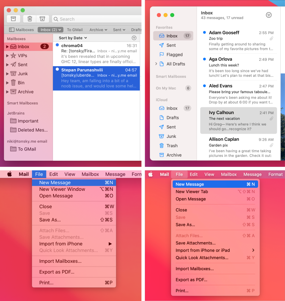
Left: macOS 10.15 (old). Right: macOS 11 (new).
Here’s the thing with rounded rectangles. They are beautiful, no doubt. But they are also pretty heavy-weight, visually. Corners attract attention, margins attract attention, padding. That’s why you shouldn’t nest one rounded rectangle inside another. That’s why selections look best when they are edge-to-edge and not rounded.
Look at the Inbox selection on the right: the window border, the selection, and the unread counters are all nested rectangles and all together looks terrible. Compare it to the clarity of the previous design. Selection itself does not attract attention, it’s true to the form of the content that it highlights.
Another problem is that nested rectangle complicates the panel. On the left, panel is just single flat surface. On the right, selection has margins. That creates a feeling that there’s another invisible panel of smaller size nested inside that beautiful flat surface. Again, unnecessary complication.
Finally, it’s just space-inefficient. Nested rectangle requires both margins and paddings, basically doubling allocated space around non-selected elements.
Unfortunately, nested rounded rectangles is exactly what Apple is doing in the upcoming macOS 11. R.I.P.