
iOS layouts post. I will describe the current logic as it is. If it sounds complicated, don’t worry: it’s because it is.
Click on the image to see full size.
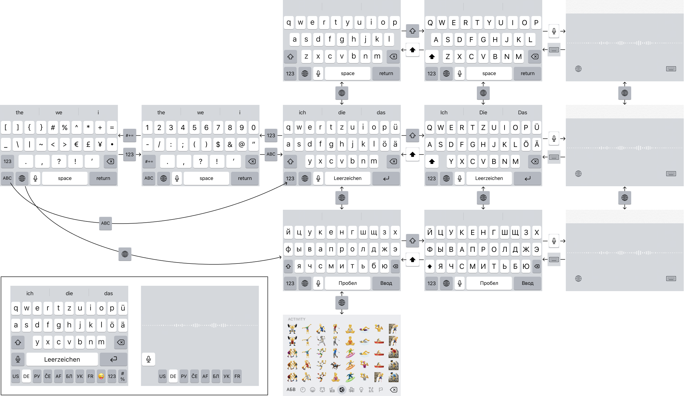
The main layout (third column) can be changed with the globe symbol. The globe switches to the last used layout. I guess someone at apple figured, if I installed three or four, it’s because I only really need two anyways.
How to get to the rest, you ask? Well, if you tap globe fast enough, it will start going through all of them in cycle. What is fast enough? I don’t know. For me it works like this: I need a particular layout, tap globe a couple of times, notice that it only cycles between the two, get annoyed, naturally start tapping faster, and eventually the correct layout appears.
The worst part about this UI is that it’s unpredictable. I don’t mind extra clicks if those clicks always lead to the same result. Humans don’t have problems developing habits through repetition. But unpredictability is the worst enemy of a good UI.
Then there’s dictation. Unlike the rest of the keyboards, dictation is a mode (there’s separate dictation for each language). Following the trend of bad design, it DOES NOT display the current language, in spite of having lots of free space. It also has globe symbol located _slightly_ different, enough to annoy frequent users. And the key to get out of dictation is in compeletely different place and doesn’t look like like anything.
Special mention for Emoji keyboard. It’s the only one that doesn’t use the Globe symbol as the rest of them, and the only one where this button is located in a different place. So in fact I can’t cycle through layouts, not really, because once I get to the Emoji one, I have to click in a different place to keep going. Even US people, who, I imagine, have only two layouts (US and Emoji), must be suffering from it.
Okay. Shifted layouts are ok, I guess (fourth column). Single key, always in the same place, gets you in and out. No surprise there.
Although there was a notorious moment in iOS history when actual keys on the keyboard were ALWAYS UPPERCASE, even in a lowercase mode. I guess someone at apple decided to bring limitations of physical keyboards (which can’t change their labels on the fly) to the digital world. Beautiful, but unusable.
And finally, numbers. Let’s not focus on the fact that 123 button is 1 pixel narrower than the globe one next to it (and #+= is TWO pixels wider :). Technically, numbers are just another layout. It’s not even numbers, it’s numbers AND special symbols. But there were not enough space for all of them, so they decided to split it in two.
So, problems. First, the split between symbols in 123 and symbols in #+= is more or less arbitrary. I guess, it’s based on frequency, but that doesn’t help when you are looking for something in particular: Apple might know the frequences, but you don’t.
Next, in its essence, symbols are just another layout. But they have a separate button to access them. Why?
Finally, #+= symbols are two levels deep. You have to go to the numbers first using one button, but then click ANOTHER one to go deeper. This is problematic because 1) you need to go through the layout you don’t really need, and 2) you need to click in two different places, which means rescan the screen, figure out what’s going on, locate the needed button, etc.
Getting out of there is not easy, either. For example, to get back to numbers, you have to click 123 button, which used to lead you to specials symbols, but now it leads to numbers. If you click to where the 123 used to be, you’ll end up in your primary layout, not the numbers. The point is, buttons change meaning and places all the time, again, blocking you from forming a habit.
Overall experience feels like a maze. You click random things trying to get somewhere. After enough clicking, with some luck, you’ll probably end up where you wanted to be. Not the best experience.
The solution? It’s a classical navigation problem, solved million times by now:
- There should be a single button for each mode.
- They should all be visible at once.
- They MUST have fixed places.
- And the current one should be highlighted.
Look in the bottom left corner where I drafted a prototype. In my prototype, it can easily accomodate as much as 8 languages plus emoji witout a problem. I imagine this is more than anybody would ever need, but just in case someone needs more, you can always make it scrollable.
Sure, it wastes one extra row. That would’ve been importnat on iPhone 4, but starting from 5 onward, screens are only getting taller. There’s plenty of space even on my 8, and even more on X or 11.
Also, Emoji keyboard needs a search. Just saying.