
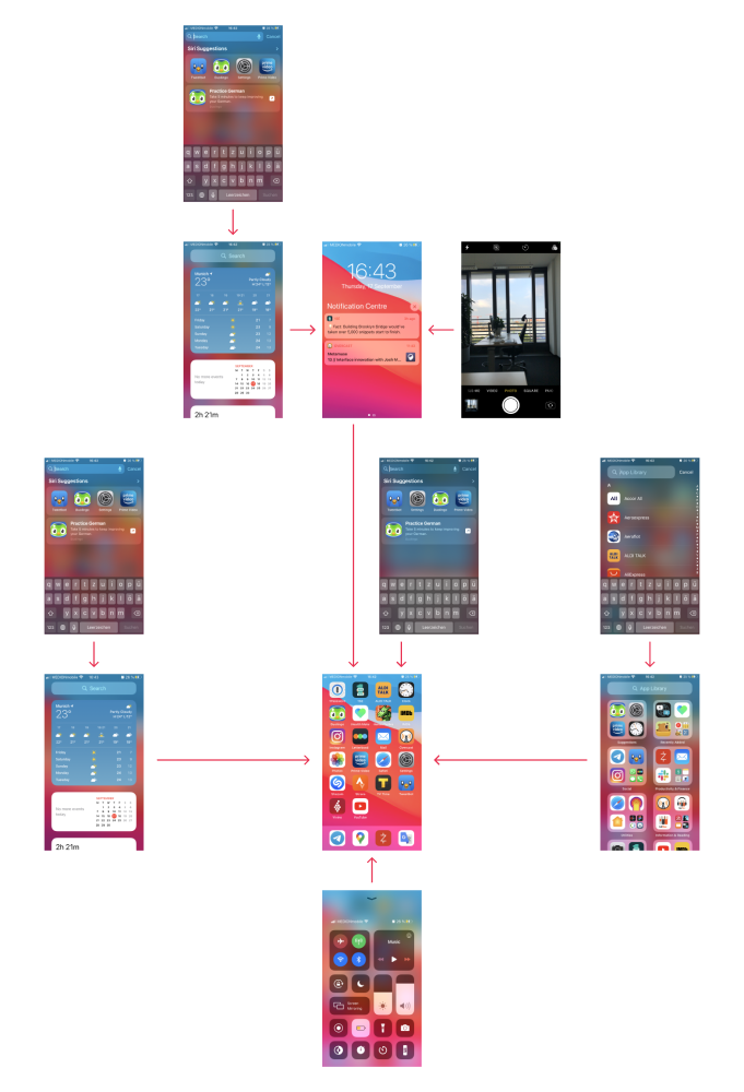
iOS 14 screen navigation. The screen only has four sides, so how many pull-up screens can you put there? A lot!
The best and most reliably working one is Control Centre. It solely occupies the bottom and I couldn’t be happier about it.
On the left from home screen is where widgets live. On the top from the widgets there is app search! To get there you need two pulls, well, it’s not the limit!
On the right now where App Library lives. Looks pretty useless, sorry Apple. But top from there is another app search, different from the one from the widgets! Again, two-step pulling needed to reach it.
The most ingenious iOS invention is that there are two different ways to swipe from the top! One brings app search (same as from widgets) and another brings up lock (notification) screen! This is gold: from there you can go to the widgets screen, and from the widgets screen you can go to the app search! Three-step pulling to reach the screen we’ve already seen twice! You can access camera from there too, if control center or home screen icon are not enough ways to reach it.
To sum up the most crazy parts:
- Two ways to pull from the top, leading to two different screens.
- Two different app searches.
- Old one can be reached in three (!) different places.
- Longest sequence of consecutive pulls: three.