
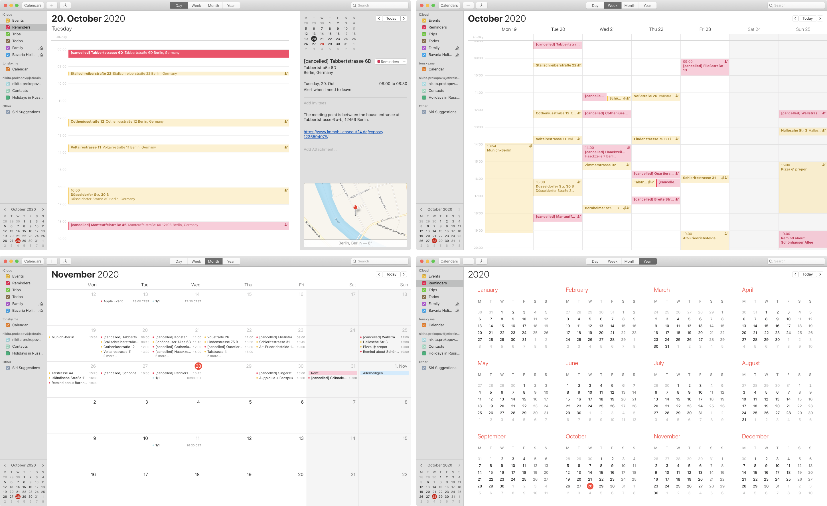
The inefficiency of Apple Calendar kills me. So much empty space, yet the important information is collapsed to a comically few letters.
Day view: we stretch each event to the whole screen width. Unnecessarily. Yet we can barely fit just 12 hours at each moment out of 24. Humans are awake at least 18 hours a day, hello! Plus sometime we have to wake up early to something — wouldn’t want to miss that.
Week view: most useful of all. Same 12 hours problem. Also, each event title is truncated, just to few letters if two events intersect. “Schö...”? “Tastr...”? Seriously? While 70% of the screen is EMPTY?
Month view: a day has 6 events? How about we show you 4? Good enough for you? Hope you can remember the last two. No matter that the rest of the month is literally empty, each empty day will take exactly the same amount of space.
Year view: don’t show any events at all. This is just a calendar card.
You’d think that other calendar apps, the ones that have a business based solely on selling a better UI, would invent a more efficient information representation than Day-Week-Month-Year. As far as I looked, they all just copy the Apple design :(
P.S. Thanks @monory for showing me that you can switch to 24-hr view instead of 12-hr that is default. The problem with overlapping events and truncated titles still stands, though.