
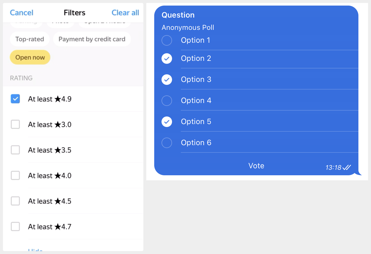
Left: exclusive choice (radio buttons)
Right: multiple choice (checkbox)
Both are wrong! Let me address the new generation of UI designers who are growing accustomed to the idea that anything can look like anything and the only way to figure out what you see it to try to interact with it. The convention is very simple: exclusive choice should use circles, multiple choice uses squares.
This is one of the few simple, good and more or less consistent visual aids in UI design history. Until now, anyway. Please, can we keep it going for at least a little bit longer?
Thanks @mxtnr for the left picture