
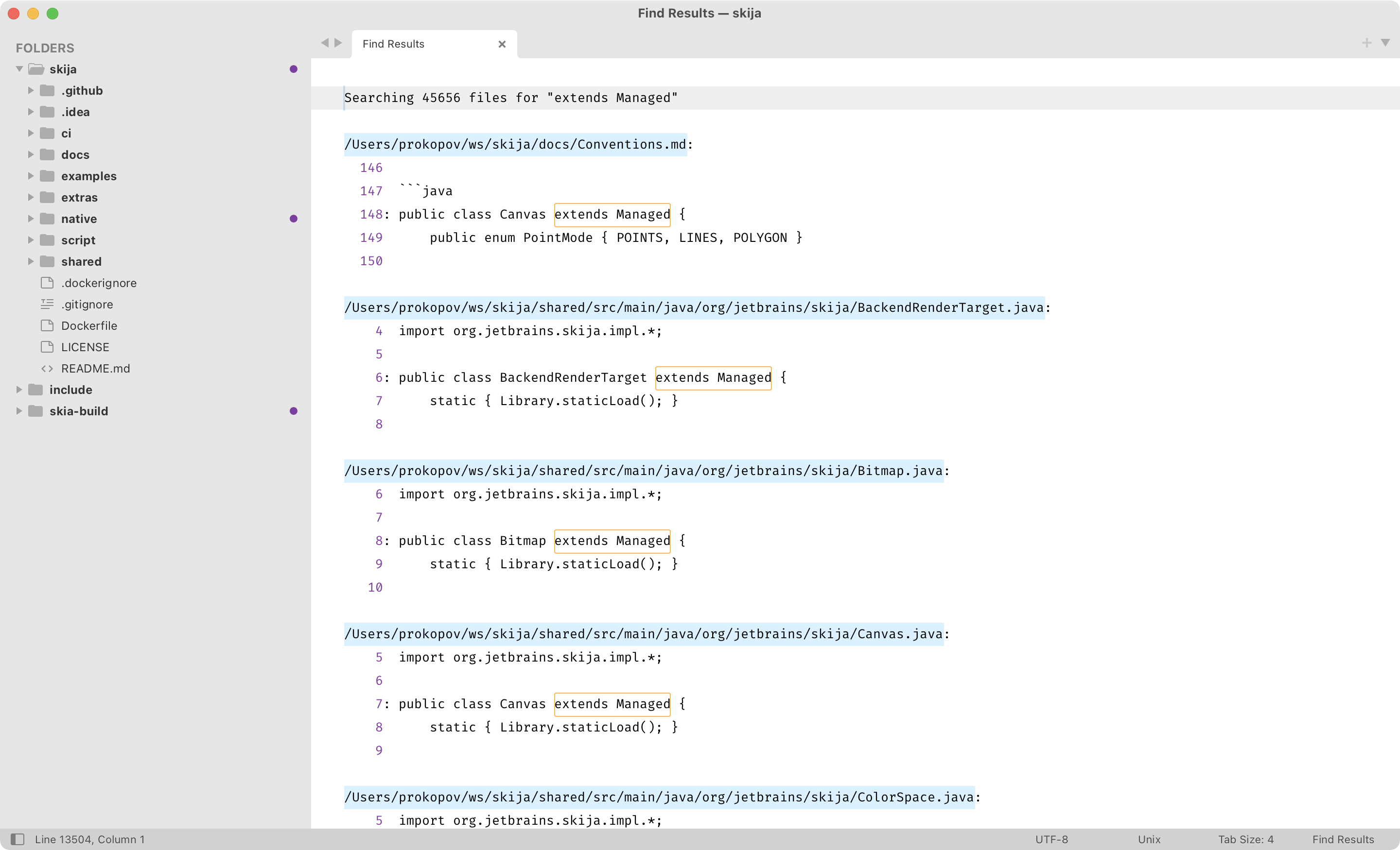
The genius of Sublime Text “Find in Files” window: it’s just a regular text buffer.
You see, there’s nothing special about this UI. Because it’s just a tab (instead of a panel or a dialog), you can do anything you can do with a normal tab. Move it around, open/close, split etc.
Because it’s just text, you can do anything you can do with text: navigate with normal commands (up/down/page up/page down/etc), select, copy, search (!). Yes, you can further refine your search results by searching in search results.
Finally, it looks like normal text. It’s not set in another font, it uses your normal color scheme, it looks familiar—no context switching and adjustment.
This comes with a cost, of course. There’s no handy shortcut to jump between results. No collapsing the results. No “show more/less context”. Any UI/UX designer looking at it would immediately have hundreds of ideas on how to improve it (by adding more UI, of course, because that’s what UI designers do).
And yet, it’s the most natural, easy to use, least attention-demanding UI I’ve seen. Hope Sublime team will keep it this way forever.