
UX acounts on Instagram offering WRONG advice:
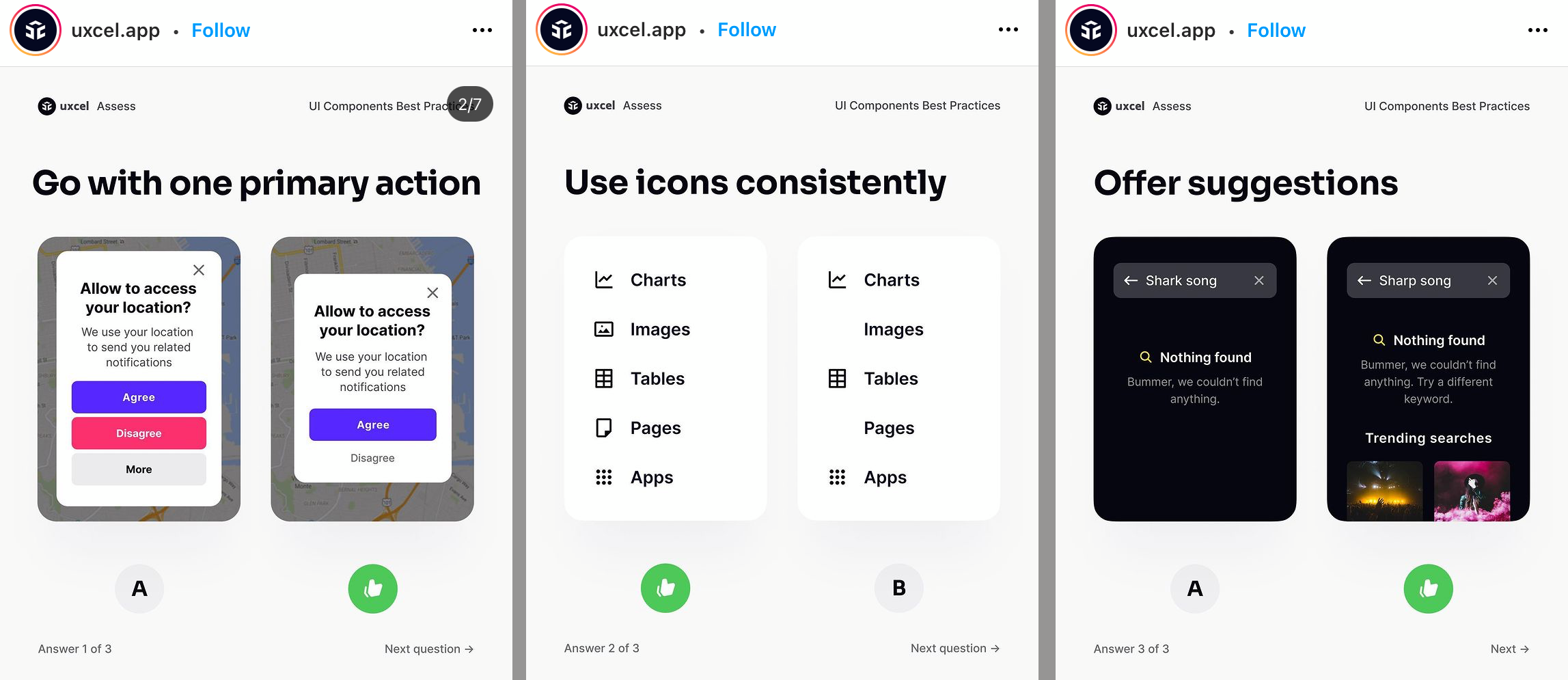
Left: Tricking user into preferable (for the company) choice, removing ability to read more.
Center: If everything has an icon, nothing stands out.
Right: Muted, almost hidden _actual_ result (Nothing found), replaced with promo bullshit nobody asked for