
This is NewRelic, a website to monitor your infrastructure: your servers, your clusters, your message queues, your everything.
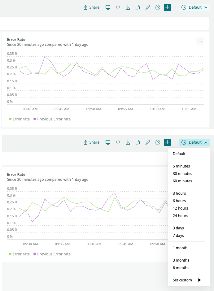
By default the show you graphs and charts and issues for some date range. Usually from the past 30 minutes.
And yet. Instead of immediately showing "30 minutes" they show "Default".
They already know what the default is. The person looking at all this may not know or remember what the default is. Their old UI would show the actual date range.
And yet, some product manager looked at it and said: nope we're being too useful, we need to hide information from people.
And don't get me started on the 12-hour clock with AM/PM that can't be changed to 24 hours "because there's not enough demand to do this".
All these unnecessary things require *more* engineering effort to design and code than *not* doing them.