
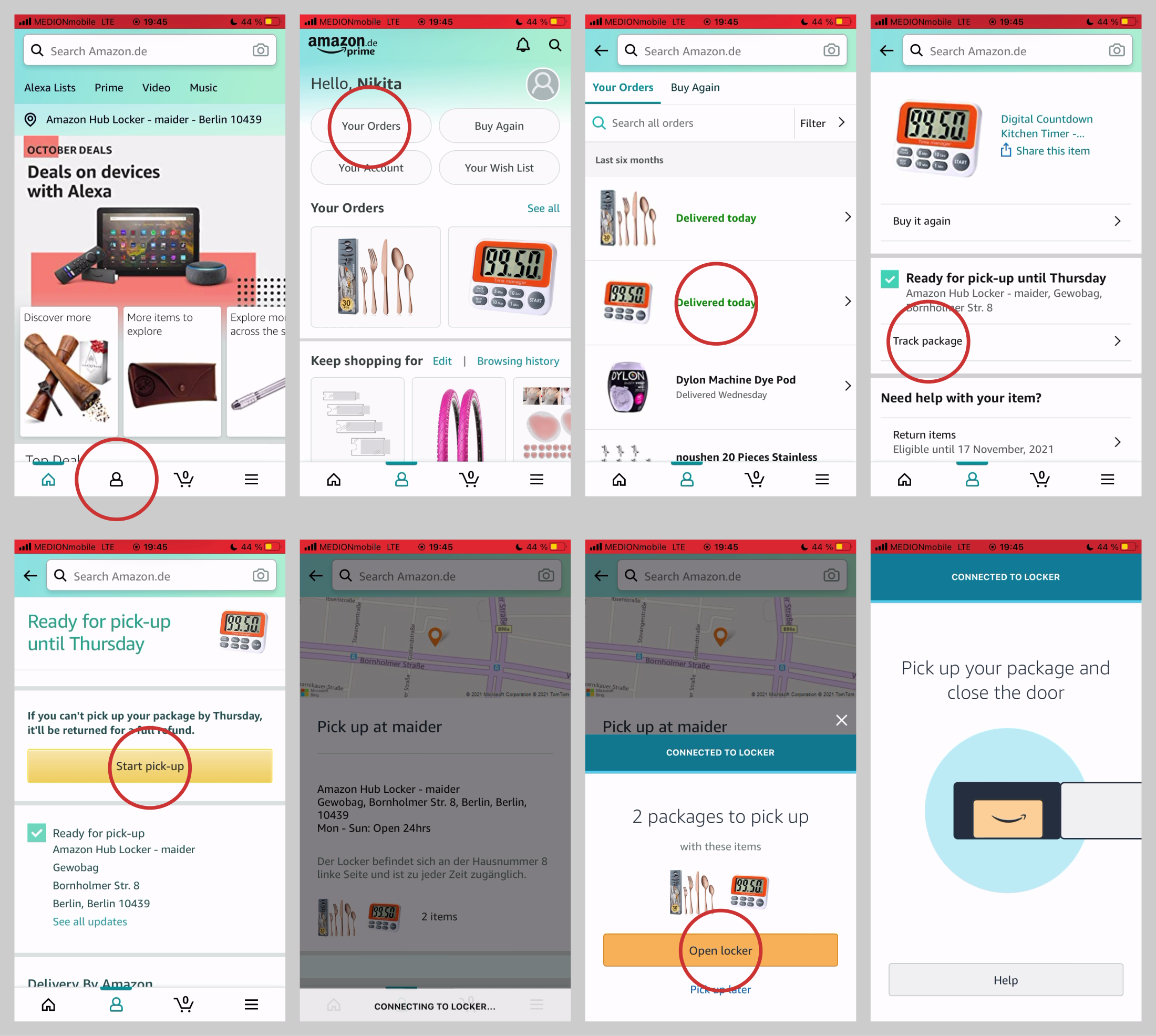
It takes 6 screens for Amazon app to get to the “Open locker” button. During these 6 screens you have to click at barely visible and completely irrelevant “Track package” link. There’s no indication anywhere in the app that you have parcels waiting for you. There’s no grouping by locker either.
This is what puzzles me. Everyone who uses Amazon lockers HAS to go through all these 6 steps every time they order anything, right? This feature has almost 100% usage rate among people using lockers.
So why hasn’t it been optimized in any way? Because Amazon has already charged you money and now it’s your problem to figure it out? Because you have no other choice but to figure it out?
Anyways, a good illustration to why bad UX is not an obstacle for a successful business. And why you should not copy Amazon design decisions.