
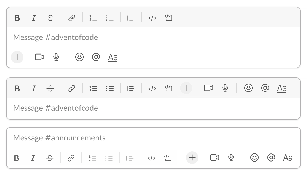
Top: bad. Working area clamped between two toolbars. Feels claustrophobic.
Middle: better. Single toolbar, but message area feels secondary and the toolbar dominates.
Bottom: best. Message comes first, formatting is secondary and does not dominate.
Top: bad. Working area clamped between two toolbars. Feels claustrophobic.
Middle: better. Single toolbar, but message area feels secondary and the toolbar dominates.
Bottom: best. Message comes first, formatting is secondary and does not dominate.