
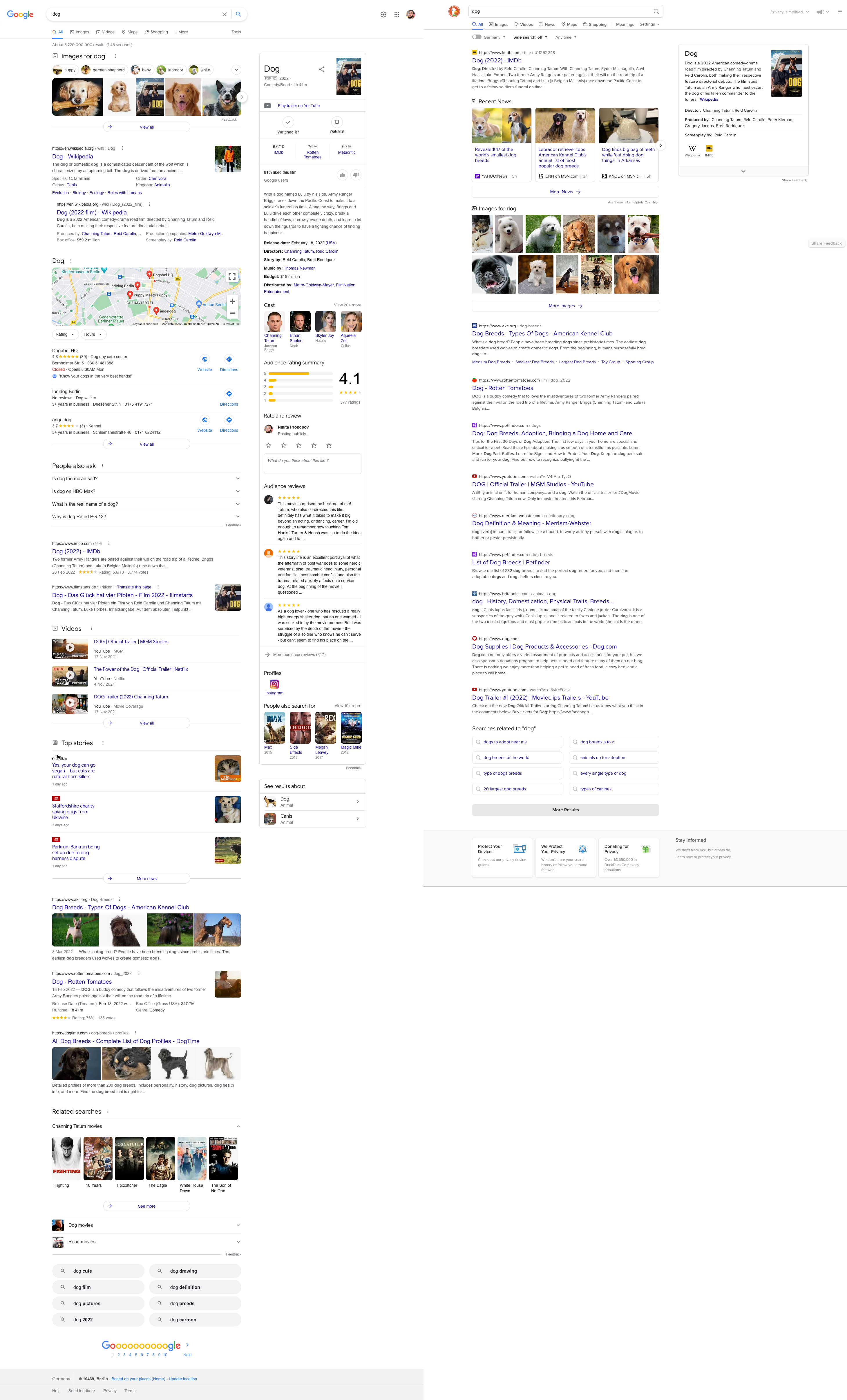
Left: Google search page for the query “Dog”
Here’s what’s in it, top to bottom:
- 5 search suggestions
- 5 images
- 1 search result
- 1 search subresult (?)
- A map
- 3 organizations
- 4 more search suggestions
- Oh wow, two more results! We’re on the third screen by now.
- Three videos
- 1 search result with 4 inline images
- 3 Top stories with 3 images
- 2 more results. This is fifth (!!!) screen by now, and we’ve only seen 6 results.
- 6 images
- 2 horizontal related searches
- 8 related searches organized in two columns
That’s 6 search results for 6 screens, interrupted by an impossible amount of distractions, all of which have different design and layout for some reason. Many of “result types” repeat multiple times (e.g. related searches and images”, leading to even more confusion
Right: DuckDuckGo for the same “dog” query.
- Three screens. 10 results. That’s 4 times the information density.
- Distractions (e.g. images) grouped into a small compact block, grouped into 1 place, presenting twice the amount of images.
- All consistently designed.