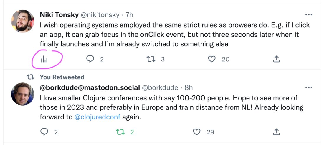
Same controls in the same place, please. For 10+ years I’ve been clicking on the leftmost icon to get to replies, to the second left for retweet etc.
Now, because new “analytics” icon is now added first, but only to some tweets (your own), it breaks the pattern. What’s worse, it creates inconsistency across the same interface, on the same page
