
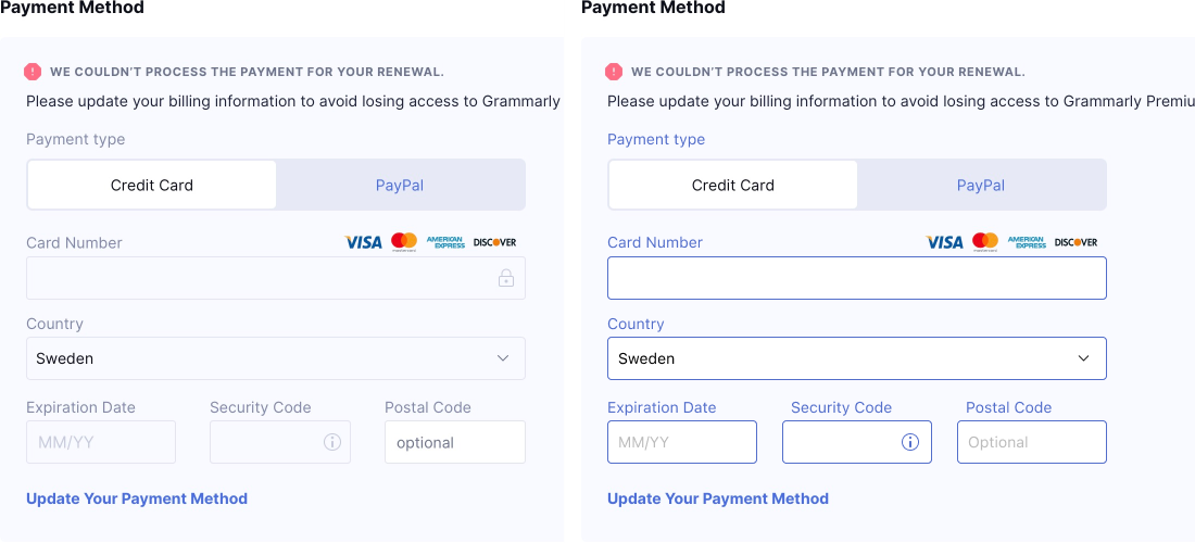
Dear designers, please don’t be afraid of bright colors and high contrast. They have a purpose: they are easier to read.
Also, low-contrast form fields have always been used to communicate disabled form elements. You don’t want your form to appear disabled when it’s not!
Left: original (thanks @bbsody for it). None of the form elements is disabled, but they look like they are!
Right: fixed version