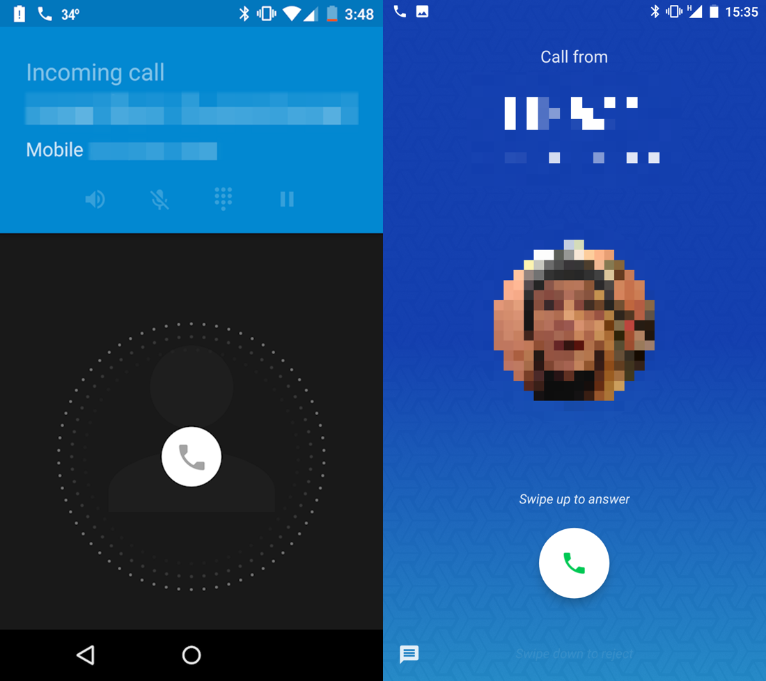

Android call screen is unbelievably wrong. It’s just impossible to imagine how could one design a call screen so wrong and then redesign it completely without fixing any of the issues.
The main issue is that you just don’t see affordances. When you receive a call, all you see is a jumping icon and nothing else. How do I accept? How do I drop the call? What are my options? Where do I press?
You might think that that little round phone icon is what you press, but no. It’s not a button. It’s _a handle_. You _hold_ it to see your options. Yes, you can only see your options after you started holding it. That’s a terrible way to interact. It’s not obvious at all. There’s no clue that suggest it should be held or that more options will appear after you start holding it. You just don’t know it until someone explained it to you. It’s also not the best experience, trying to read the screen and make a decision while holding your finger in the center of the screen.
And remember: receiving a call is a stressful situation. It’s unexpected, you feel rush to answer, you probably spent last minute trying to reach the phone itself or trying to get it out of your pocket without accidentally pressing anything (which adds to the rush), you’re trying to understand who’s calling you and all that. You just have no time and no concentration to figure out whatever UI logic Google has invented for you. It’s just the wrong situation to play charades or trying to look slick and minimalist. Anything you see on the screen at that moment should be immediately obvious, no room for misinterpretation, no room for guessing and experiments.
That continued until Android 6, if I remember correctly (if not, it’s not that important anyways). Just FYI: to accept the call, you have to slide right from the center of the screen. Slide left was “drop the call” and slide up was “drop and reply with text”.
Then Android 7 came and they redesigned it. Did they fixed any of the above? No. They improved the looks and did one thing they should’ve never done. They changed one invisible gesture to another one. Starting from Android 7, you’re supposed to slide up to accept the call. Which is no better or worse than before, in general sense. New users wouldn’t care.
But if you used Android 6 before, the only way to make peace with that terrible screen was to learn and remember to always “slide right”. You can only reasonably use it by forming and habit. And the Android 7 ruined it with no apparent reason. Instead of fixing the screen, you now just have to learn another habit or panic every time you receive a call.
They also added text, which would’ve helped if it wasn’t that tiny and if you had time to read small print under the pressure of incoming call.
Why not add Accept/Drop buttons explicitly to the screen, visible from the start and painted in universally acknowledged green/red? Well. Well... Ask Google, I guess