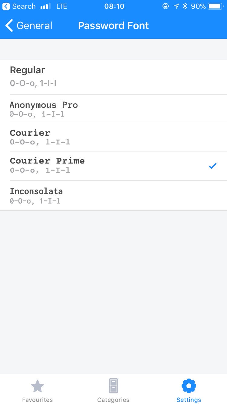

1password mobile app lets you choose your own font for displaying the password. Yes, they make a good presentation of good/bad sides of each option (easily confused characters), BUT:
1. This is perfectly solvable by the app designers. No need to involve users.
2. Three of those fonts are effectively unusable because “0”/“O” look the same. Why offer font options that are known to be bad? It’s obvious from your own examples.
3. Out of the last two, both have confusing lowercase “l” which could easily be read as “1”. It’s obvious it’s different when placed next to “1”, but not so if you see it on its own.
If other app made the same mistake it could be understood: maybe they just haven’t thought about it. But here they have clearly done their research, put together a nice presentation and yet completely failed.