
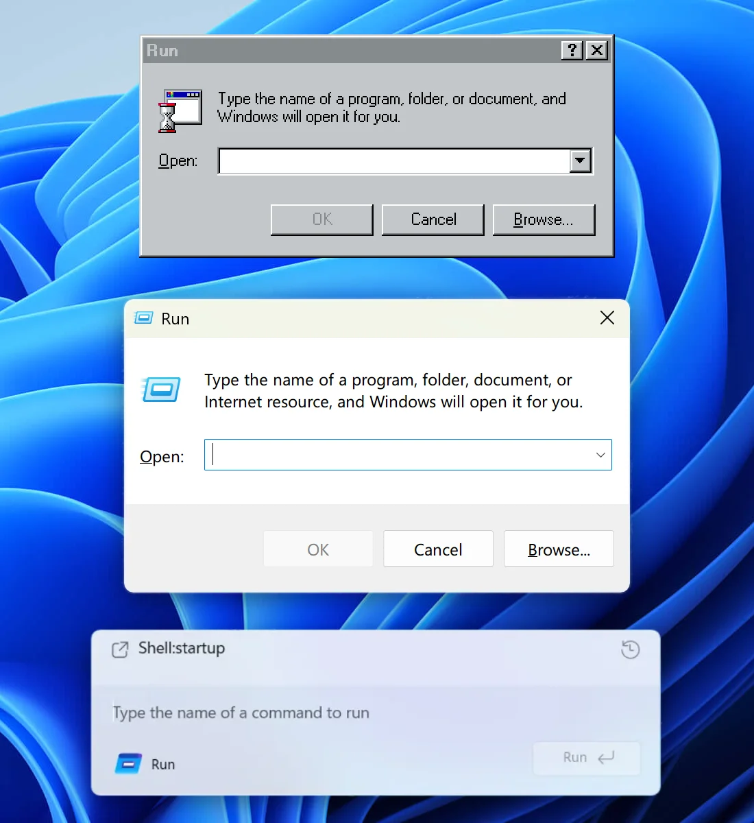
How UI degrades over time.
Top (Windows 95): great contrast, obvious shapes. Instantly readable.
Middle (Windows 11): shapes are still self-explanatory, but contrast is gone.
Bottom (Windows 11 Insiders): what am I even looking at? The only shape I can understand here is the Run button. Barely visible, though.
Then, on the left, there’s another something that says Run and has an icon. What is it? A window title? Another button? Why does it have to say Run twice?
Shell:startup looks like a header but from what I understand is actually your previous command. Also, why is it aligned so poorly? Text to icon, bottom padding?
Finally, the text input. Do you see it? I don’t. But it’s there. The only hint is a barely visible white (???) cursor before the placeholder. How do we know it’s a placeholder? We don’t.
The original Windows 95 interface is _functional_. It has a function and it executes it very well. It works for you, without trying to be clever or sophisticated. Also, it follows system conventions, which also helps you, the user.
I’m not sure whom the bottom interface helps. It’s a puzzle, an art object, but it doesn’t work for you. It’s not here to make your life easier.
Bottom image source: x.com/phantomofearth/status/1996660509027062148