
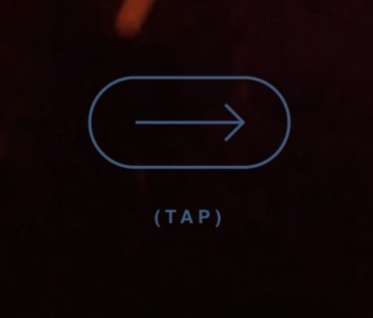
It’s always funny to me when a website has to explain what to do with it because there are no obvious controls or visible content. That’s a problem of your own creation.
It’s even funnier when the interaction icon itself is confusing enough that it needs explanatory text beside it. Choose a better icon, or just use the text.
All that said, in this specific example, the choice of an arrow to represent a tap is very unconventional.