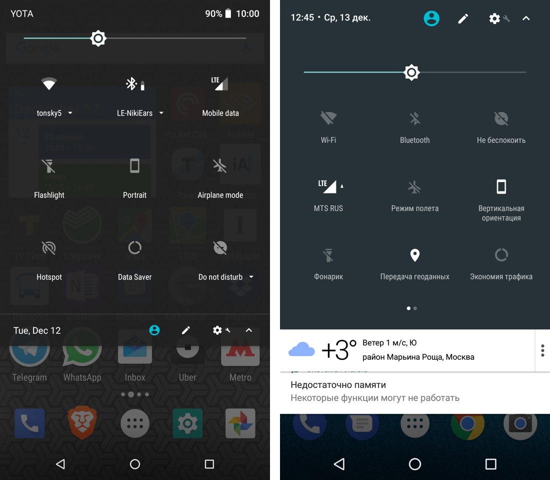

transparency is ugly. It doesn’t automatically make your UI lighter nor does it add “another dimension” to the UI. It’s just noise and dirt and it makes everything messy no matter how hard you tried to clean it up. It has no function (it would be foolish to pretend someone could see anything through that “glass”) yet it distracts the hell out of me. Don’t