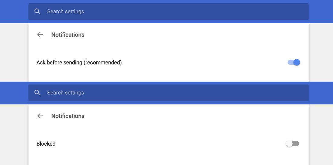
I want to turn off notifications in Chrome completely, and after digging into four levels of settings (it was in Advanced → Privacy and security → Content settings → Notifications, of course!), I see a switch that's in "Ask before sending (recommended)" position.
The only reasonable alternative in that binary switch for me is "Don't ask before sending", which, of course, couldn't be recommended.
Turns out, the alternative is "Blocked".
The whole idea of binary switches in UI is that one position is implied by the other. It's YES or NO, DO or DON'T. But in this case two positions are from different levels completely: one DISABLES the feature, another one FINE TUNES the feature.
I understand that fine tuning like this assumes the feature is enabled, but this kind of implication just breaks the UI language.
