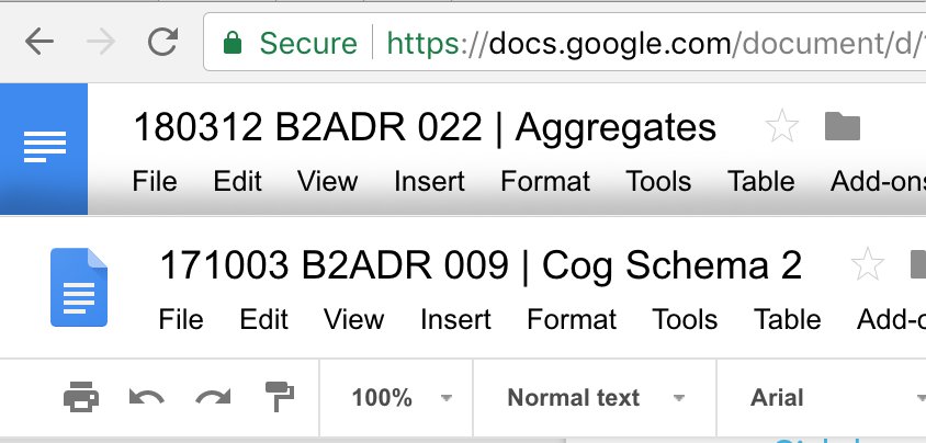
Google Docs has a strange problem.
Just yesterday (literally!) I was about to write how their “back home” link reminds you of anything but a link or a back button or even a logo. That blue rectangle that fills left corner? It’s not even their logo! It’s not even _a_ logo. So I’m always confused when I want to exit the doc.
But today they changed it! It’s now a proper icon, which is also a logo of a service, which is conveniently located in top left corner, so it should be fine now, right?
Well, they got themselves into something else. Their logo looks like a document icon. Yep. An icon of a single document. It’s even located next to its name. It’s a convention we were all accustomed to since Windows Explorer days, way before internet. Do you click a document icon to go back to the folder? I don’t think so.
I guess Google Docs need a new logo now.
