
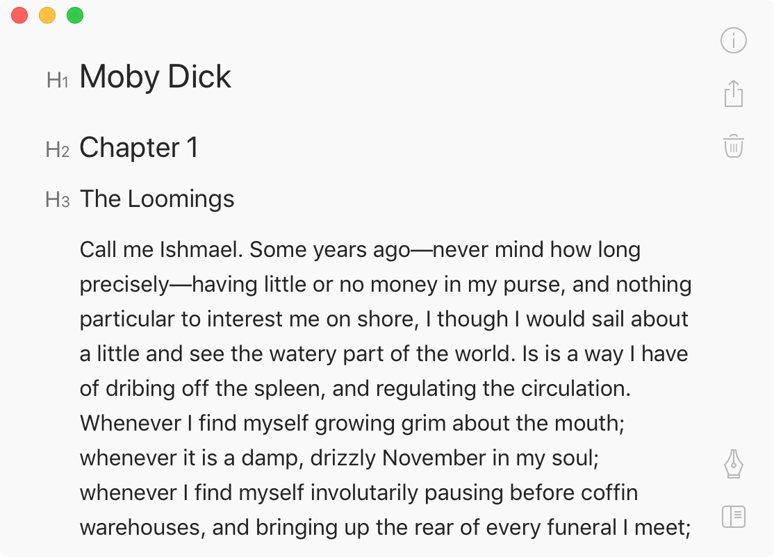
One of the stranger things Bear app did is how they decided to emphasize headers. First, if you’re WYSIWYG, you don’t need any additional means to mark headers out. Bigger, bolder font is self-explanatory.
If your text input is plaintext, though, like Markdown (note: Bear app is NOT plaintext), then you have to invent a convention. What’s great about Markdown’s is that they use symbol that you usually don’t see in a text: it’s neither a letter nor a number nor a punctuation mark. When you see this:
### The Loomings
you clearly separate the text and the markup, even in a plaintext document.
But when you see
h3. The Loomings
you can’t help but read the markup (h3) together with the text. This is annoying because you keep falling into that trap every time you encounter the header and also because it is completely unnecessary. Text is already huge, I get it’s a header, stop tricking me into reading your icons. I want to focus on content.
I guess the lesson is don’t make icons that consist of letter/numbers only and no shape.