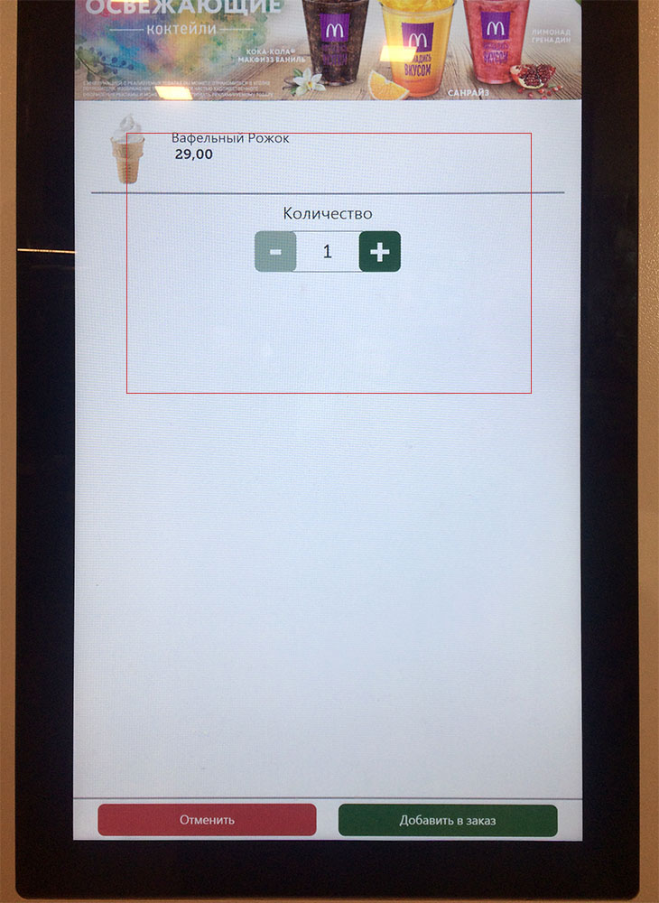
Well, nothing special is here, just an interactive panel in McDonald's. Is there any sense in leaving so much empty space in the centre? For the first moment, I even could not find those two buttons at the bottom.
Remember, you stay close to the machine so your field of view is quite narrow. There is about 30 cm (1 foot) between you and the screen. The red frame shows what exactly you see when interacting with the system. Why did they take so huge panels? They are just useless.
No doubt, this interface has never been tested by its creator in real life.
