A few months back Google's Material UI team shared how they conducted two user studies involving 200 people to tell them that yes, the design for their text input is bad. Or they could just ask any person with eyes and common sense.
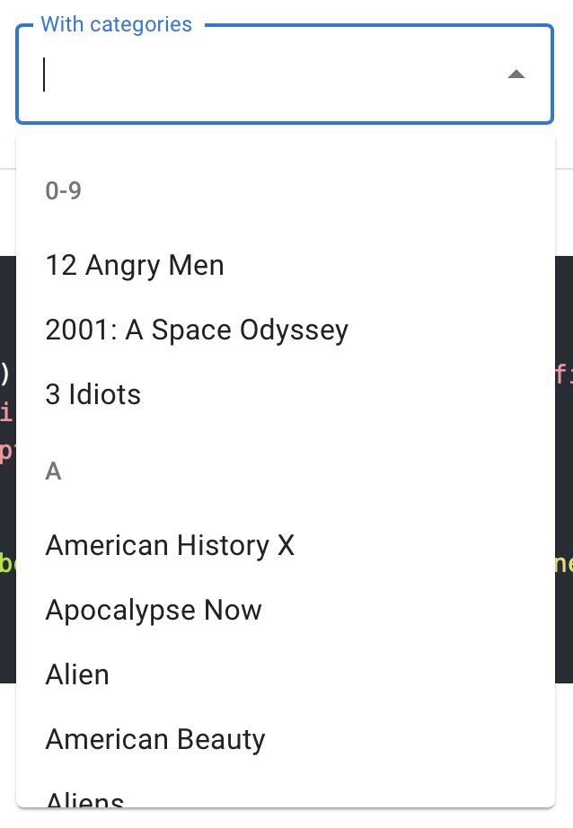
Now Material UI released a new component: autocomplete. As you can clearly see from the picture, it allows you to group items by category.
What? You can't see the difference between black with opacity 0.54 and black with opacity 0.87? Your only hope is for Google to do a study two years from now.
