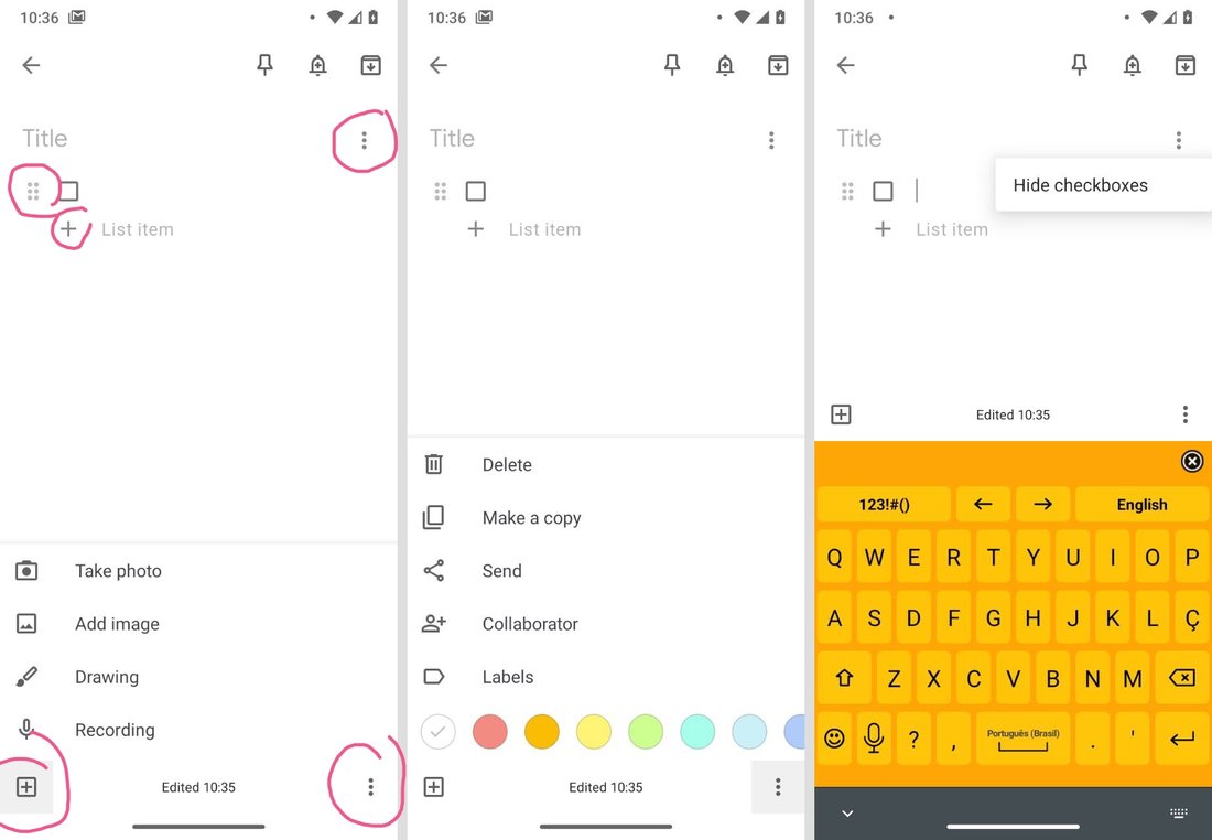
Corners are important. That’s why EVERY corner must have a dropdown menu, with different, arbitrary split, sometimes repeated, set of options.
The rule is simple: one dropdown menu for everything you can’t find place for. Don’t be smart, don’t try to group or categorize your options. You might be thinking logically but users are too impatient to figure your logic out.
Another abuser: grumpy.website/post/0OgGDdk3G
Thanks @souenzzo for pictures for this post
