
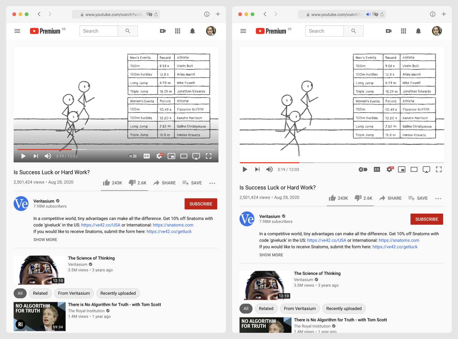
Hot take: UI displayed over content (left) is bad. Remember: user came for the content, not for the UI. Don’t hide it. Don’t cover it with gradient.
Another hot take: controls that appear on hover are TERRIBLE. Nothing worse than shaking your mouse for a few seconds waiting for buttons to appear, only to START moving in the desired direction.
Always-visible controls (right) solve both problems easily.