There are no justifications for forcing the user to use a mobile device when watching the TV. Especially not for something that already exists in your system.

I propose a new design term: "total design failure".
Definition: when every single person in the chain responsible for shipping a product looks at objectively horrendous design decisions and goes: yup, this looks good to me, release this. Designers, developers, product managers, testers, quality assurance... *everyone*.
I nominate Peugeot as the first example in this category.
Every interaction is accompanied by animation that takes several seconds to complete. Since these animations are completely unnecessary the few hardware buttons switch between screens instantaneously.
The cherry on top is that it takes over a second—with a loading animation!—to change temperature by one degree.
And no one in the whole decision chain looked at it and said, "this is unacceptable".
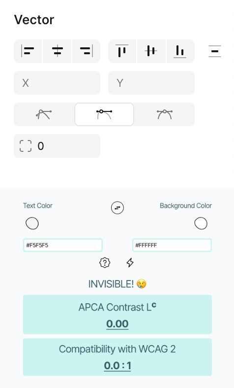
Another victim of minimalism and low contrast. Developers! Give your windows borders!
Thanks Jay Gillibrand for the picture
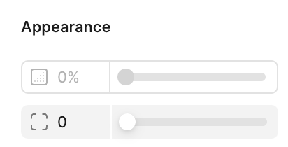
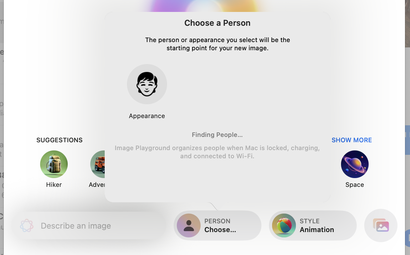
Another confusing puzzle. Which slider is disabled? According to Figma, top one ¯\_(ツ)_/¯