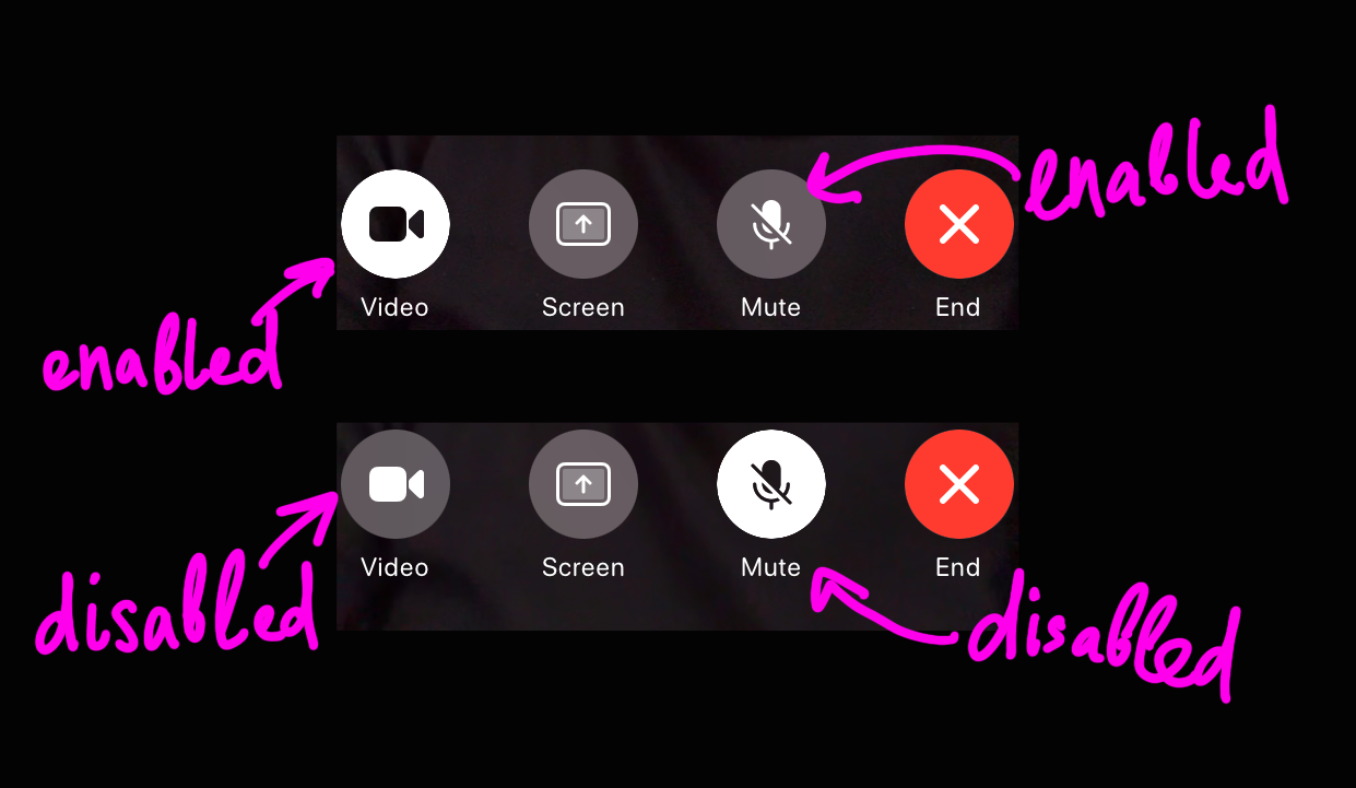
Pro tip: most users are unable to see invisible controls
Thanks @James_Kirk for the picture
Pro tip: most users are unable to see invisible controls
Thanks @James_Kirk for the picture
No wonder I could never remember where the Save button is.
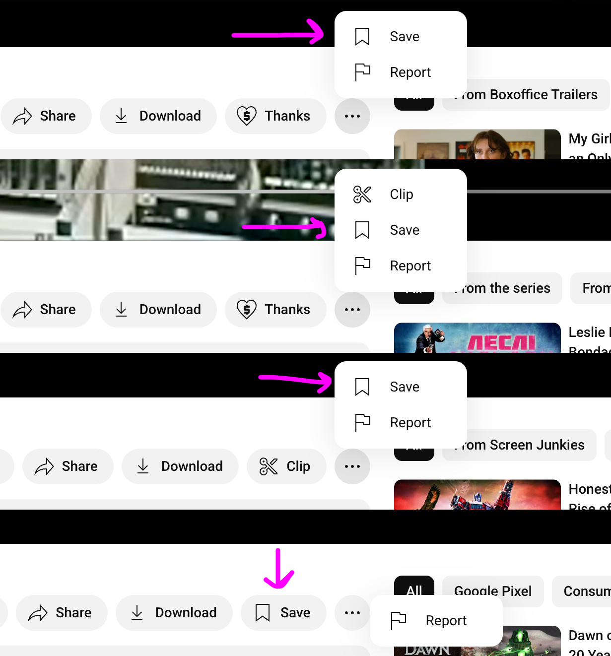
Pro tip: keep controls at the same place so that your users can form a habit
Famous Apple quality. Clicking on Apple Coverage:
- Selects Apple Coverage (That’s what you expect, because everything else in left panel works like that)
- Then selection goes back to Account
- Finally selection jumps to General (?)
- A window with a spinner appears. It’s empty but still overflows the parent window.
- It has a Done button in it (Done what? Done with waiting? Because, by definition, I have not accomplished anything by watching spinner)
- Something takes a long time to load
- Finally, content loads, and window changes size! And layout! Buttons are all different?
- Exiting popup (!) window navigates you away from where you were in main window
- Somehow it manages to shows another spinner there
Yo dawg! I heard you like tables in your tables, so we added tables to your tables!
Thanks Gamlor for the picture
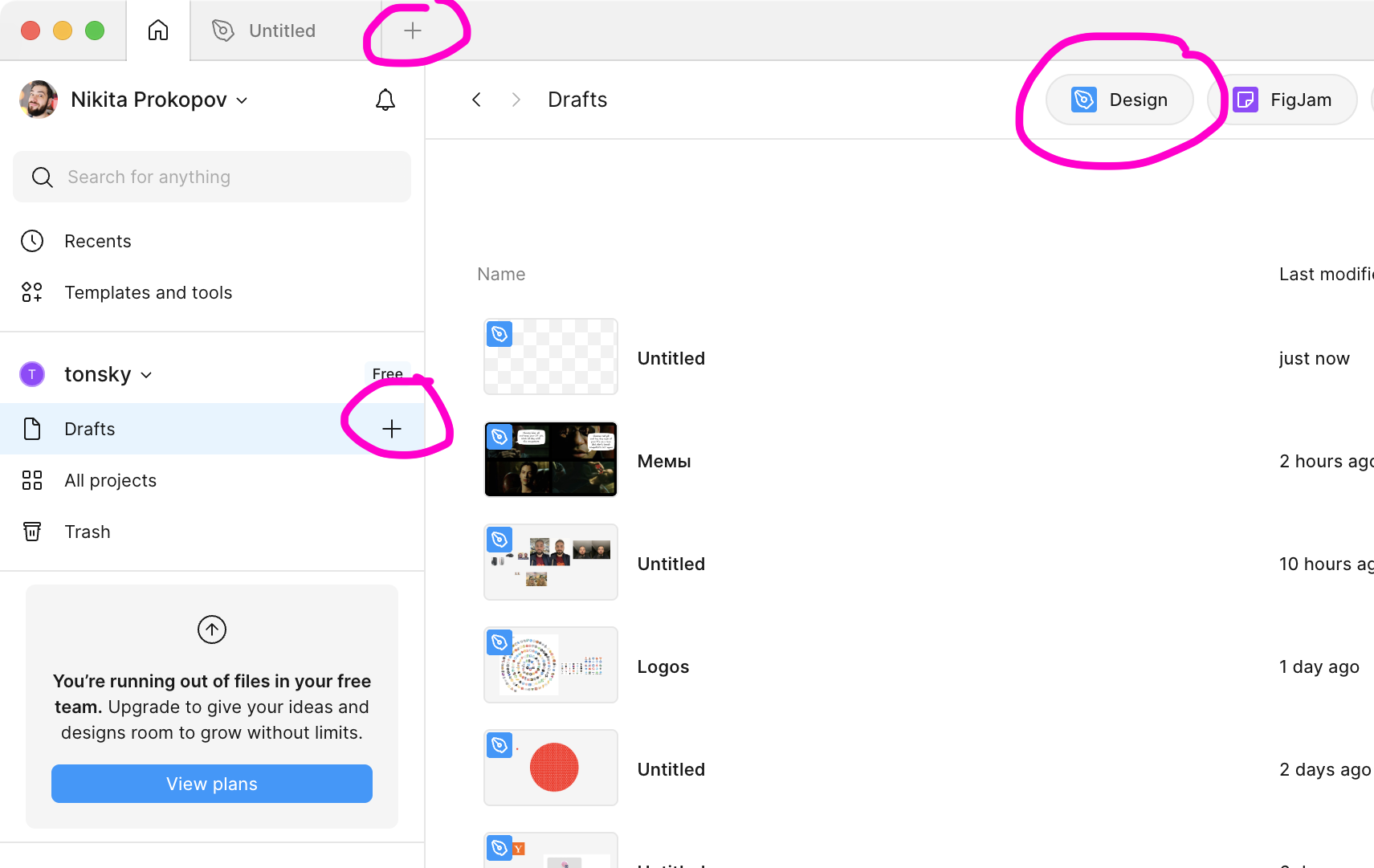
Not sure why but on Figma home screen there are three buttons to create new document. They all work differently (selection screen, dropdown, immediate action) but eventually create the same empty document.

I didn’t think this pattern still exist anywhere: you have to manually “Save” settings before navigating away, otherwise you’ll get this annoying popup.
But the question I have is: do you really expect “Discard” to be the most useful action here? Like, people mostly go to settings to change them, not to discard them, right? At least (at least!) add a “Save” button somewhere too.

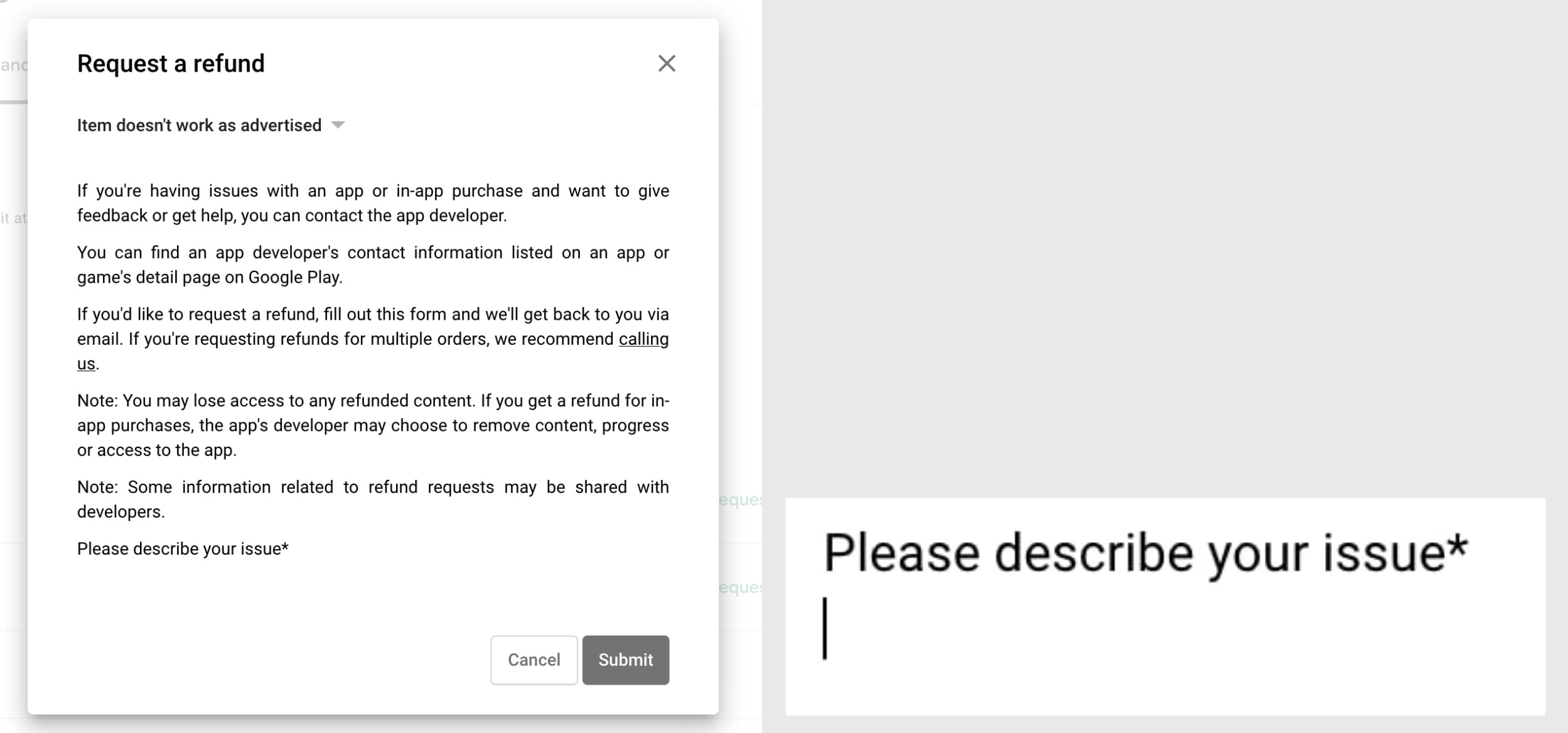
This is exactly backwards! Checkbox (top) should be square, radio buttons (list of reasons) should be round. Come on!
Thanks @chuhlomin for the picture
UPD: You can select multiple reasons, so checkboxes are correct there. My bad
This is unacceptable. Burn it to the ground