
Icons are powerful symbols that serve both as indicators and as controls. In fact, some icons are so powerful that misusing them might accidentally send the completely opposite message to your users.
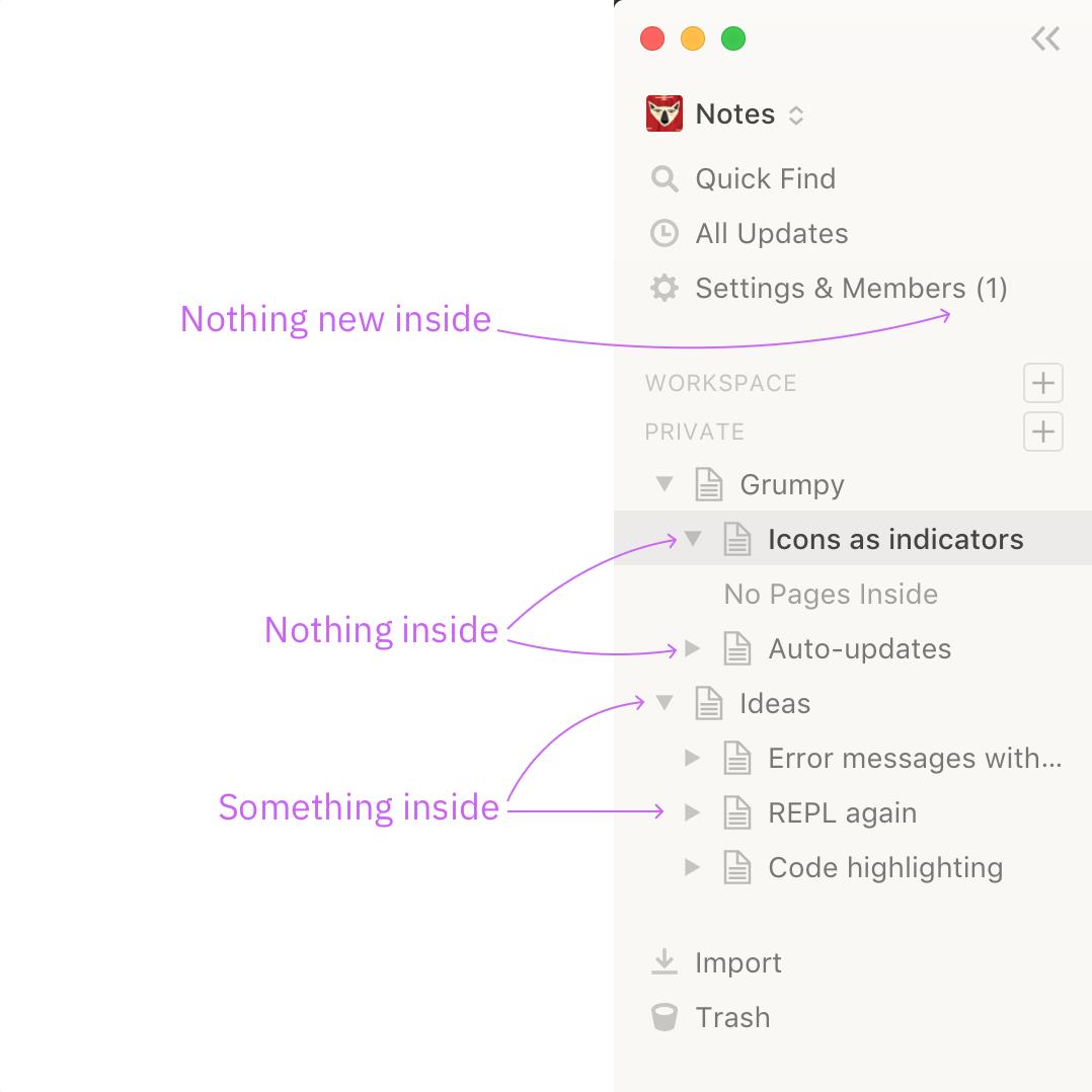
Here Notion displays “expand” triangle even next to the pages that have nothing inside. Now you can’t tell which pages actually has nested content and you complicated the whole UI with unnecessary icons. I constantly check those because “hey, I didn’t put anything in there, why do you show me that I did?”
The Settings & Members indicator is annoying too. (1) means there’s one unresolved thing that requires your attention, except it doesn’t here. In Notion it’s just an indicator of how many users are in your group. Why do you need to see it all the time? Why have you display it as if it’s a thing to resolve? I don’t know.